

Due to the sheer scope of the undertaking, a poster summary of the entire project is presented below.

Problem Space
Standing in long queues to purchase tickets for large scale events like state fairs, gaming conventions, and sports events is an arduous task. Therefore, there is a need for there to be an online portal that allows for easy and efficient access to not only event tickets, but to also the entire user experience surrounding said event. Starting off, our goals with this this project were two fold.
To build an efficient and user friendly online ticketing system for multi-day events.
It should be able to support other similar year round events hosted by the client while enhancing the entire online experience to support before, during, and after event activities as well.

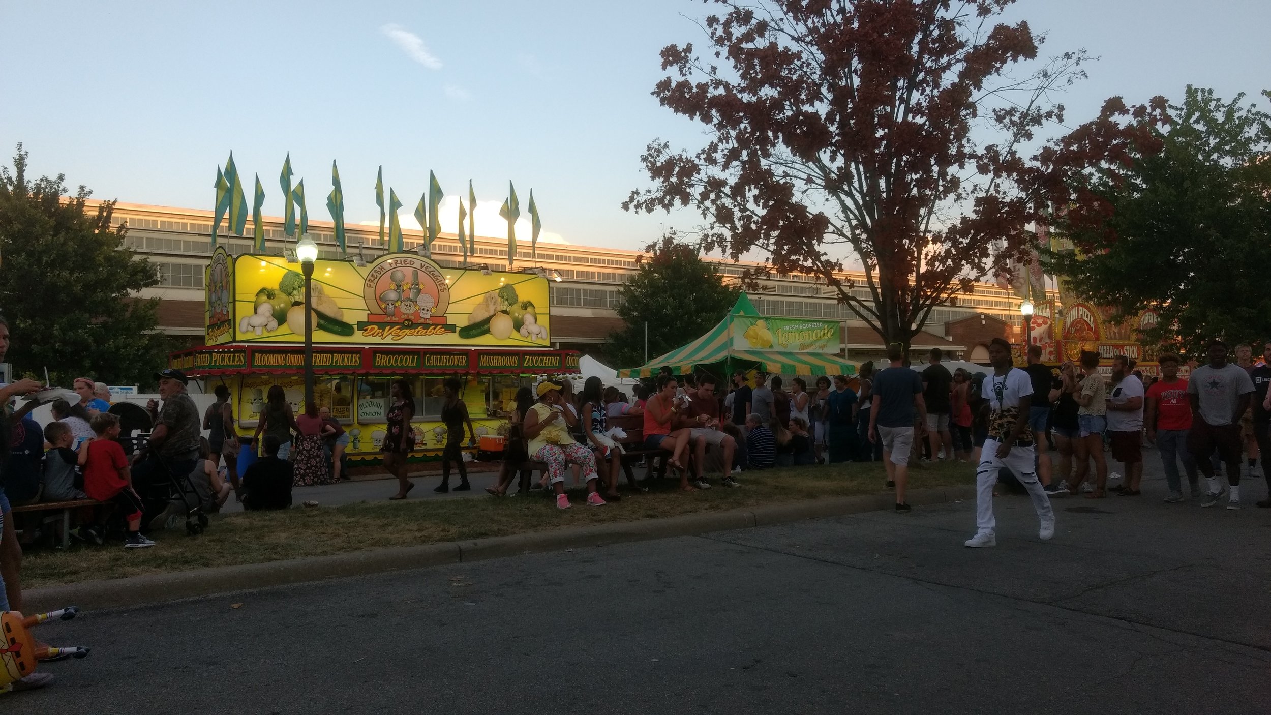
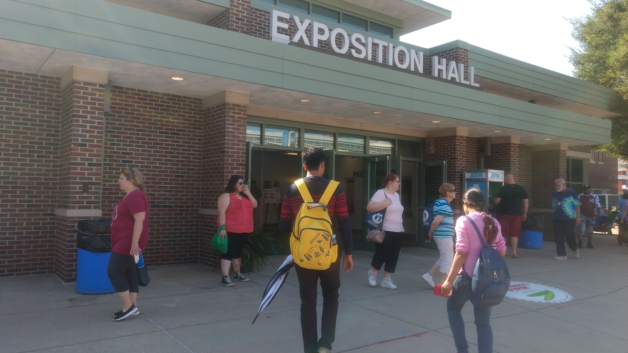
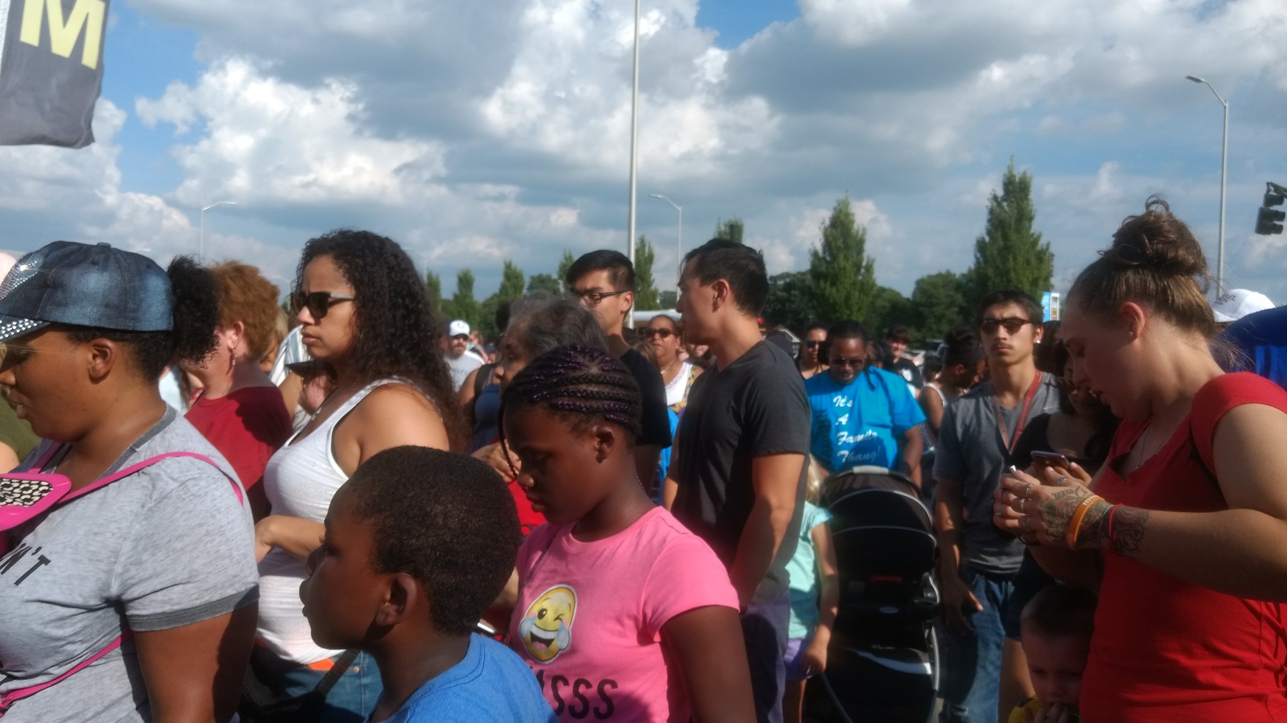
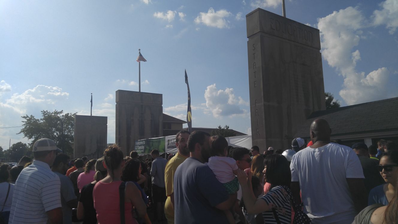
Long lines at the Indiana State Fair.
Approach
We divided this 8 month long project in two phases of four months each. The first four phase focused on user research, analysis, ideation, and down select while the second phase was more focused on rapid iterations of prototypes increasing in fidelity and then testing the developed mockups.

The design process that we followed.
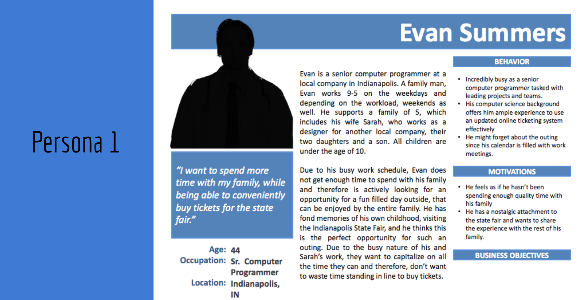
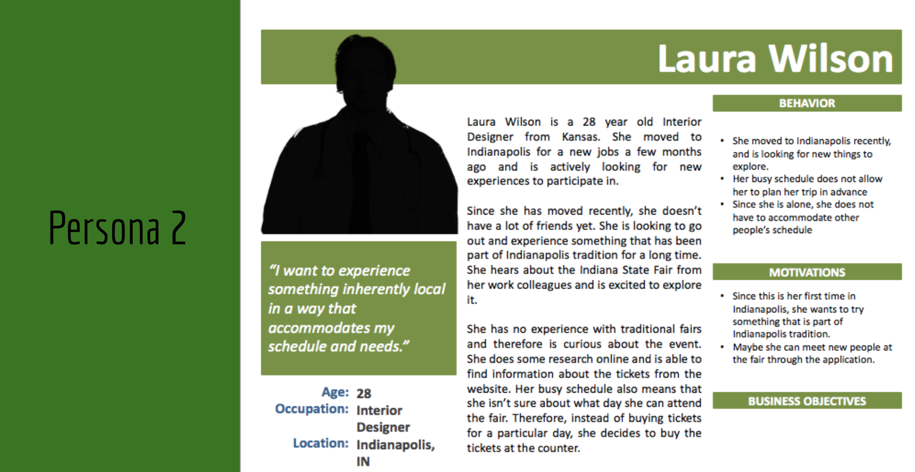
User Research
We conducted extensive user research over a 5 week period in the form of semi-structured interviews, observations, immersion activities, and a brief ethnographic research. In that endeavor we spoke to 8 participants who visited the Indiana State Fair, 3 part timer active workers, 2 retired workers, and 1 administrative staff.
User Research Key Findings
Only 10% of all the users interviewed used the application/website to buy tickets.
Users generally parked 1-3 miles away from the event in order to avoid traffic and parking problems.
There was a disparity between the mobile application and the website regarding critical information including ticket prices.
The average wait time to buy tickets was 15-20 mins.
Online ticket purchase was time consuming and confusing.
Navigation from Point A to Point B was difficult.
There were too many activities to consider and the shows displayed were not organized.
Additionally, we also conducted a thorough competitive analysis of other platforms that offered similar products. We also conducted a cognitive walkthrough of the system currently being employed by the Indiana State Fair.
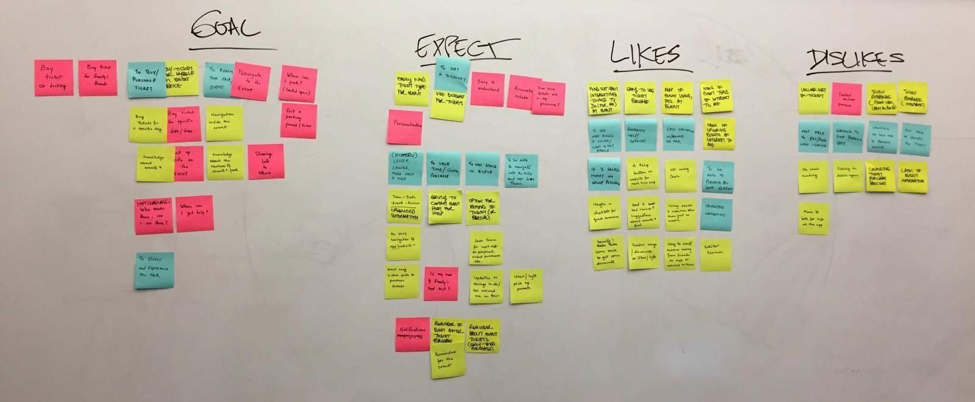
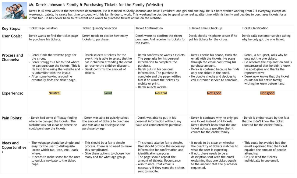
We then used affinity mapping to analyze all of our data and then created personas and journey maps to bootstrap requirements.
Based on the initial user research findings, data analysis using affinity mapping, personas, and journey maps, we came up with 5 key design considerations that would be absolutely essential for a application like ours to work efficiently.
Key Design Considerations to prototype

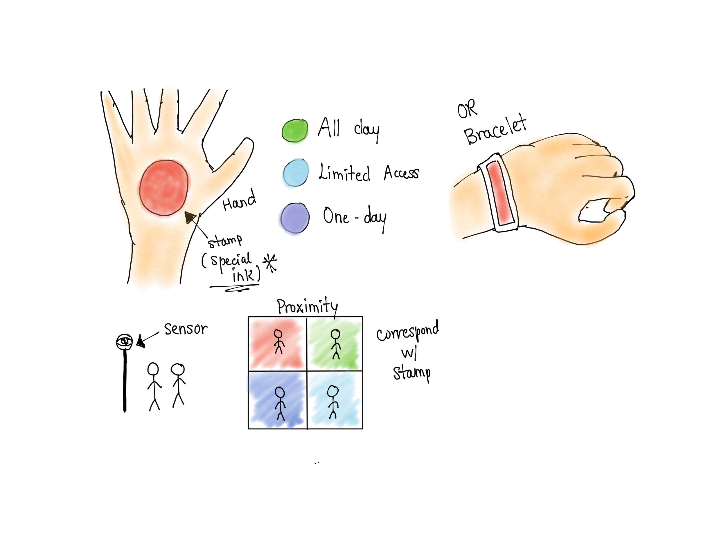
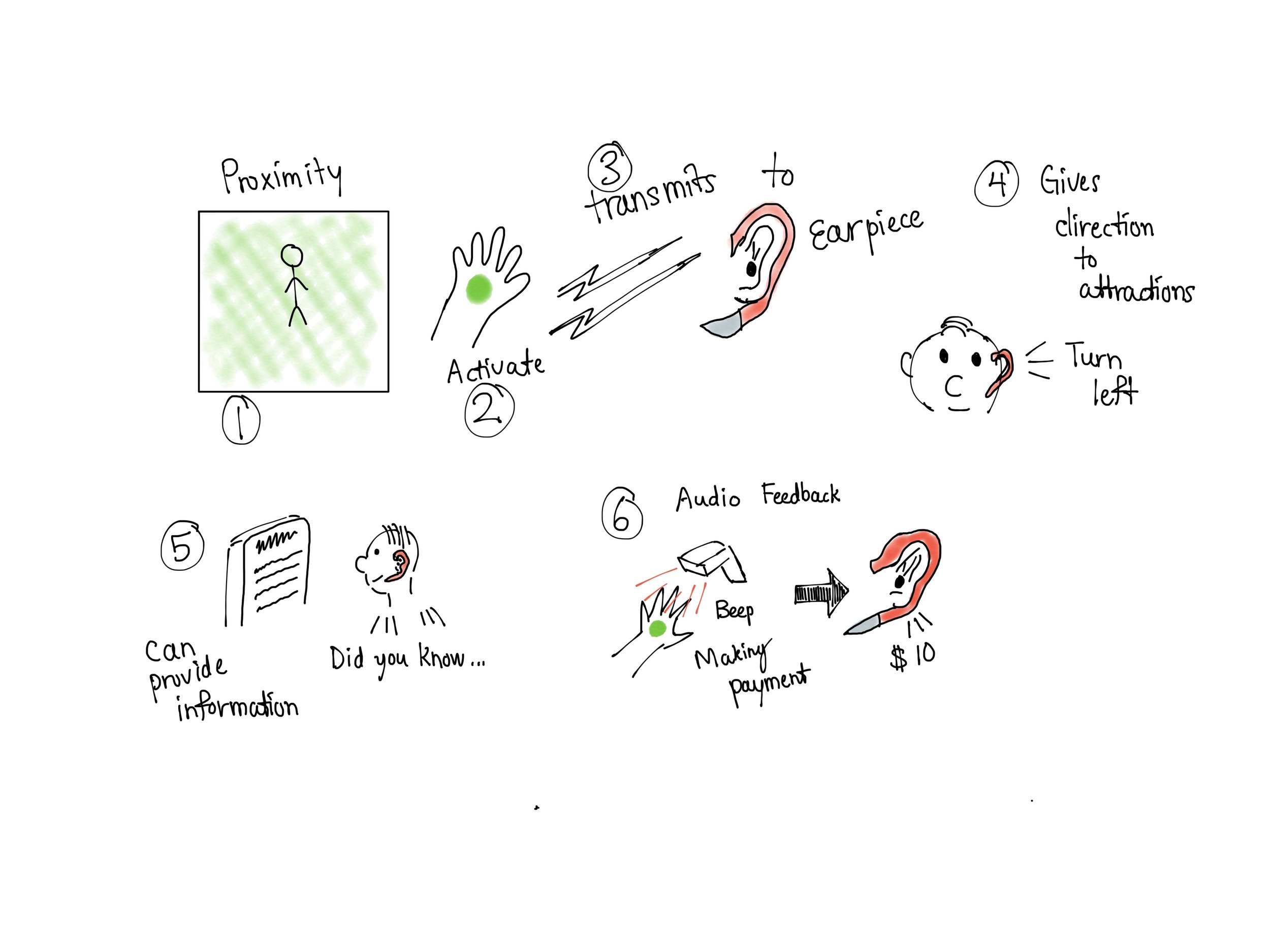
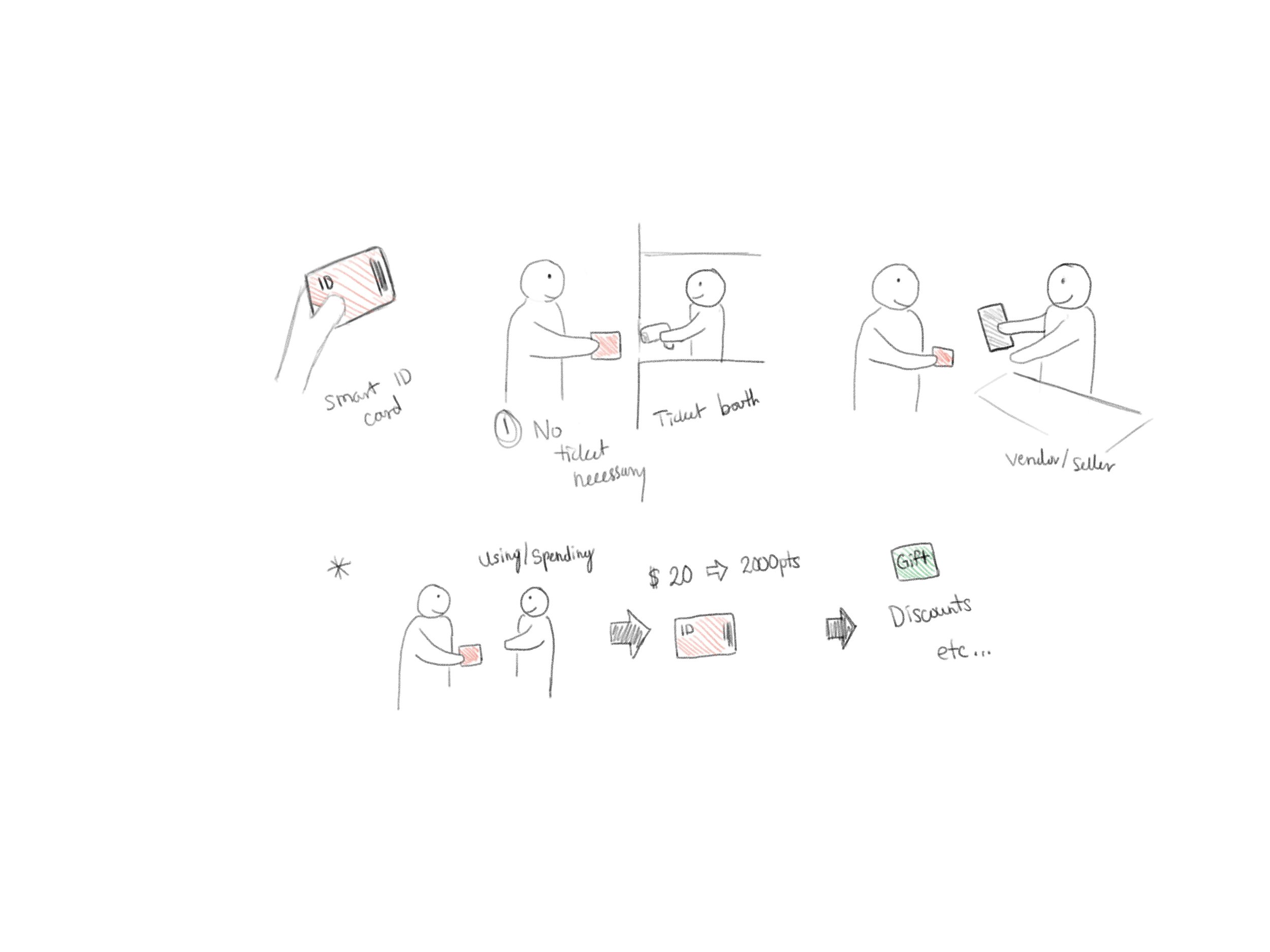
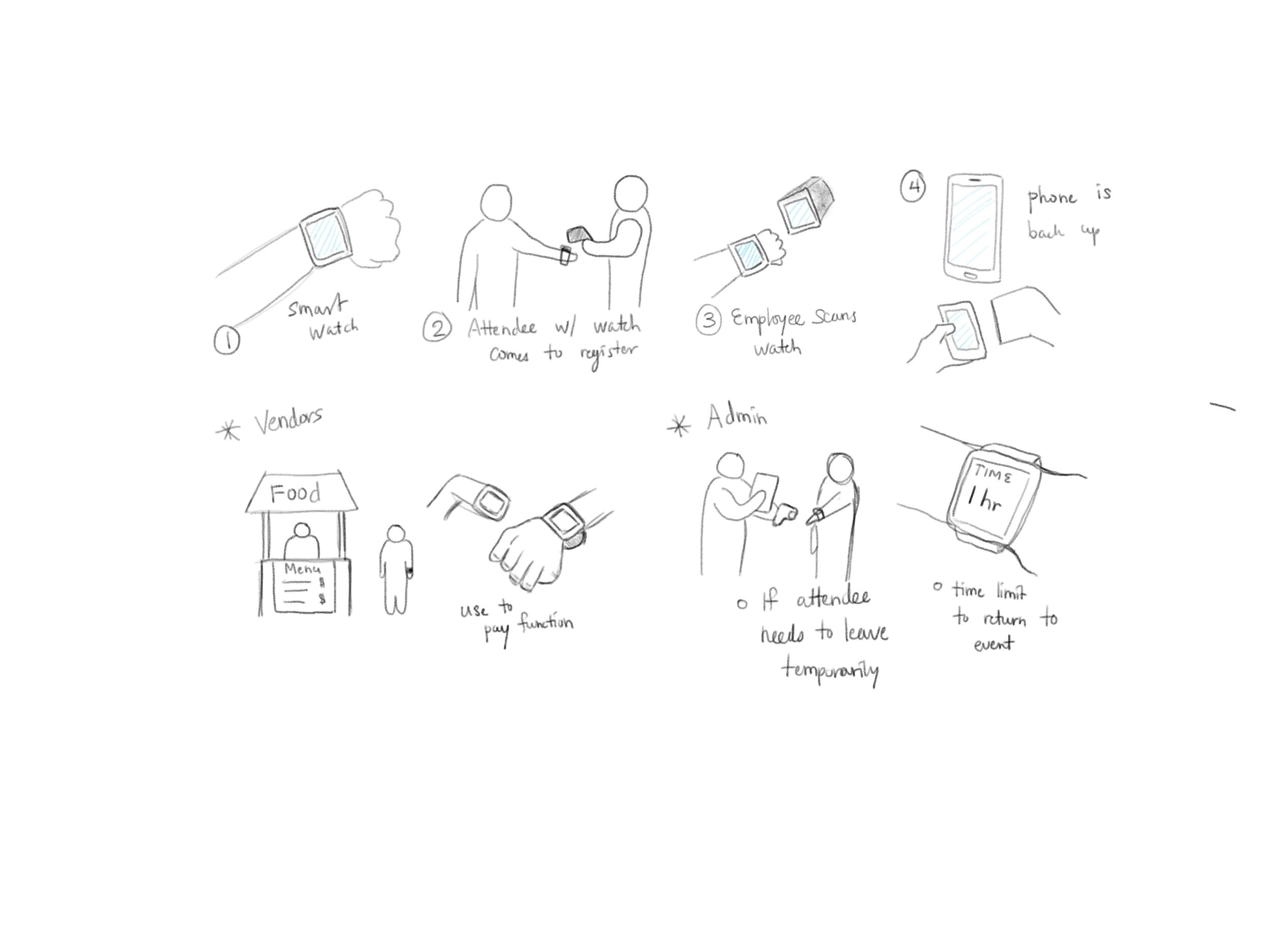
With the 5 design considerations as the base inspiration, we brainstormed over 50 ideas, which were voted down to 10. These formed the basis of the first concept sketches and storyboards. A chosen few are presented below.
Concept Sketches
Low Fidelity prototype
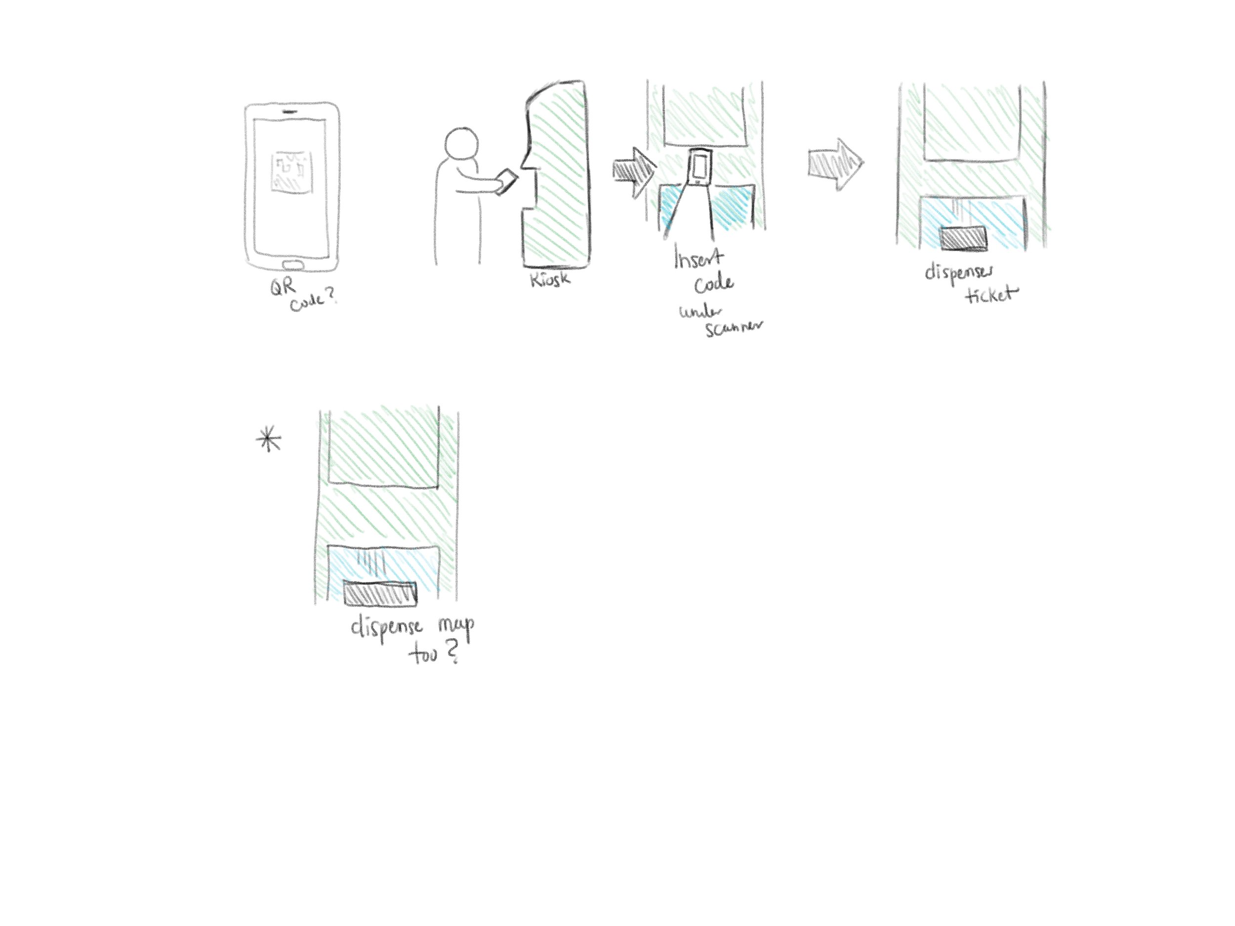
From the 10 ideas that were sketched, we down-selected to one idea that we then started prototyping. We created 3 versions of the low-fidelity prototype. The primary reason for this was that, at this stage, the prototype is still extremely malleable. Therefore, after quick agile iterations based on user testing and feedback, the product can be improved without investing a lot of energy and resources. All of the core functionalities that are required for an application like this to function can be captured. The first low fidelity prototype was an expansion on the sketches. It is presented below.
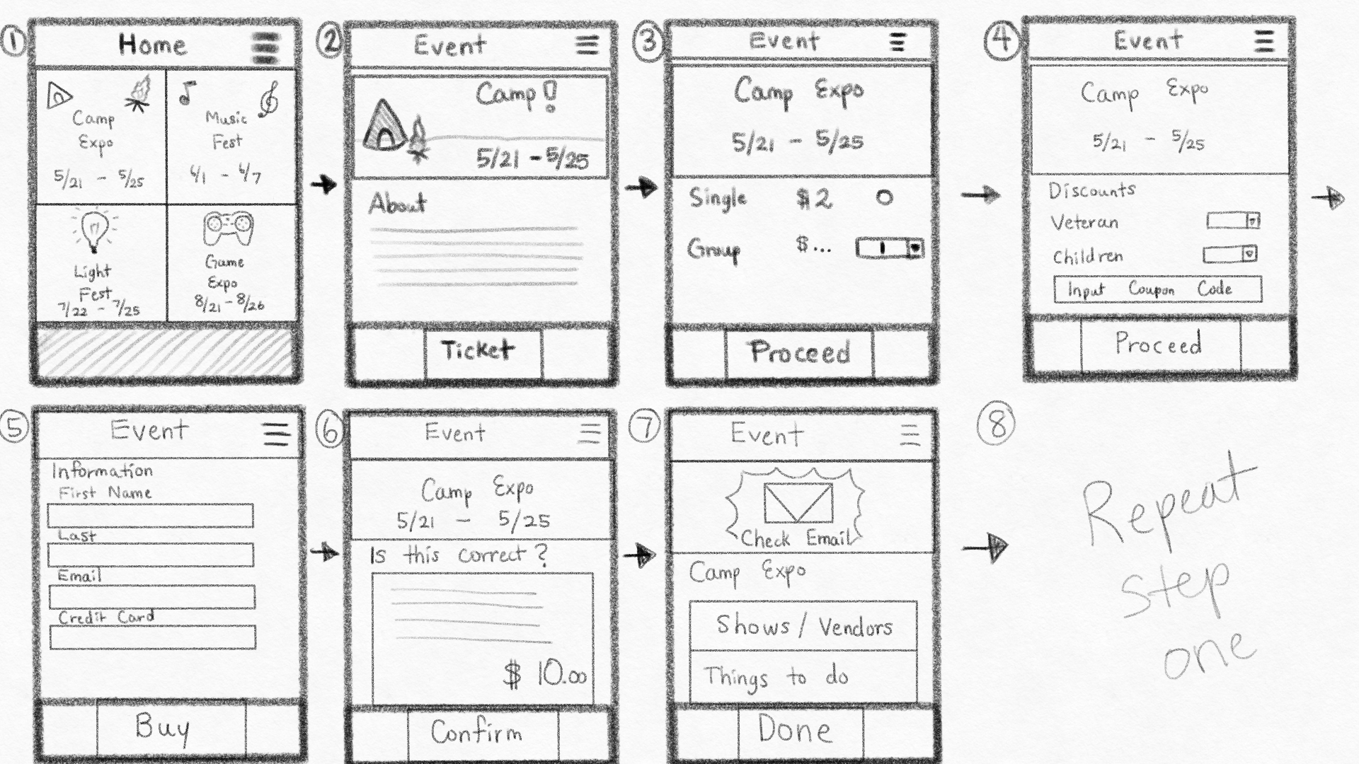

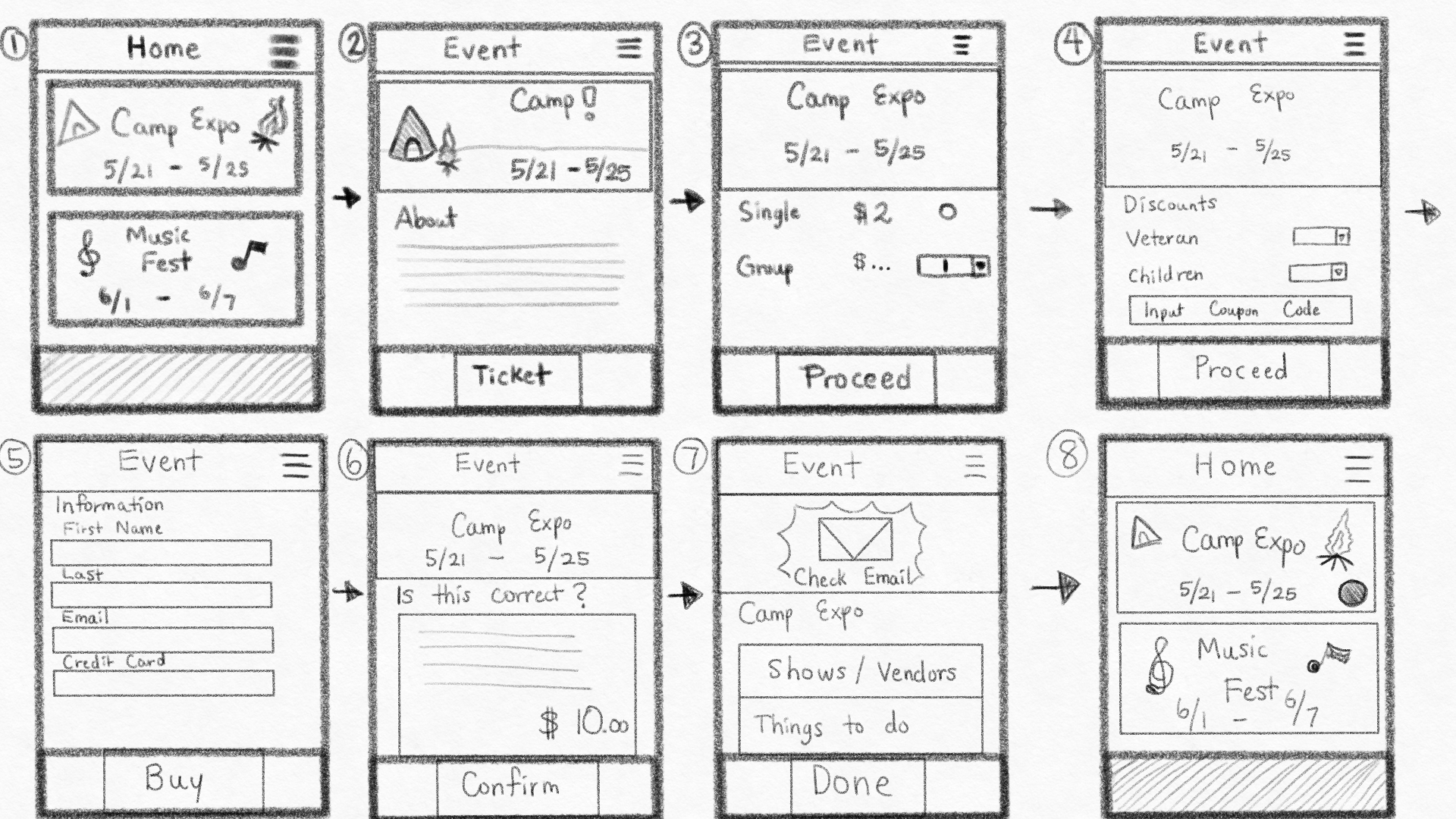
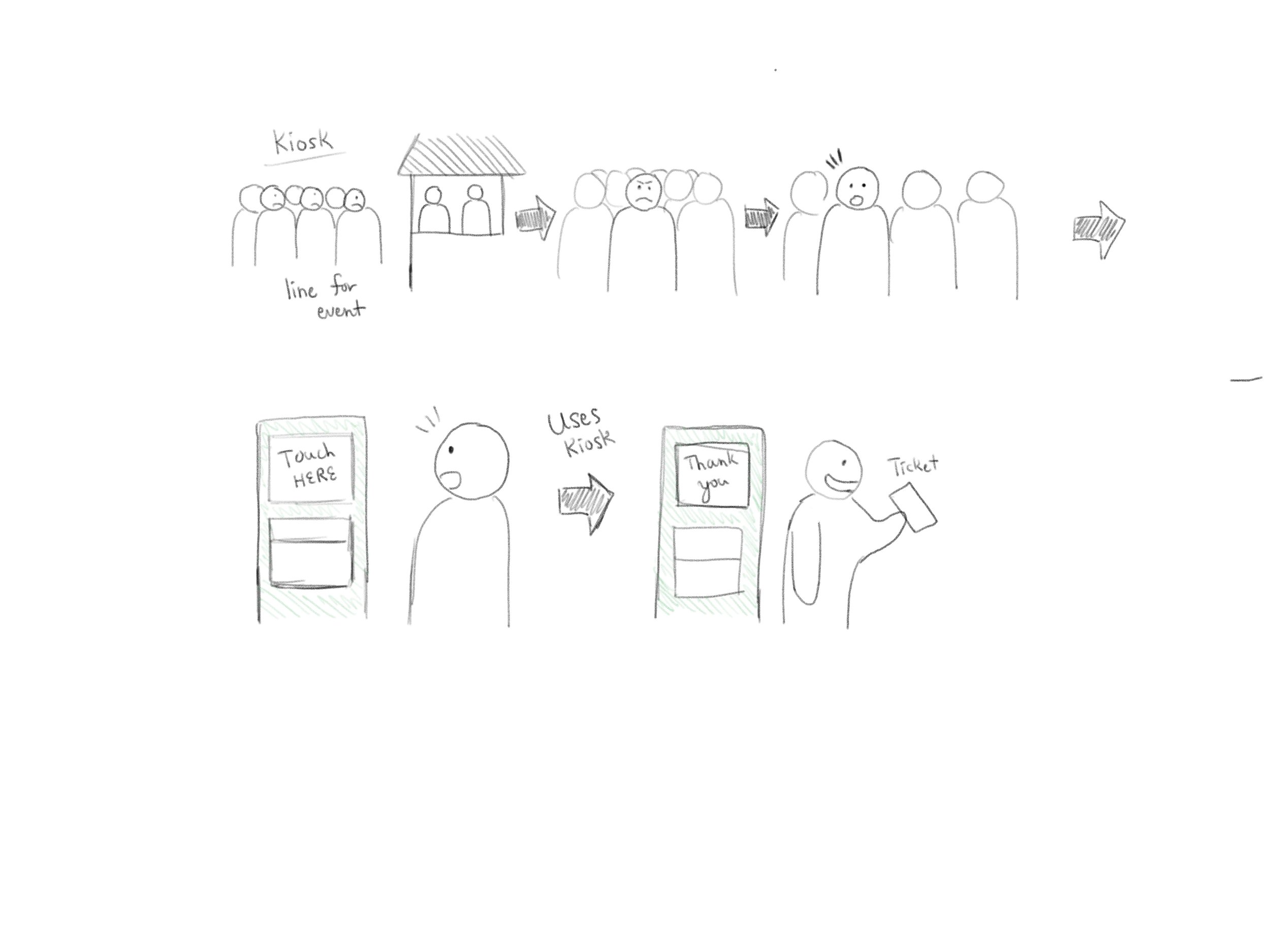
After a quick round of user testing, we created a second version of the sketches that showed the placement of button and flow functionalities more clearly.


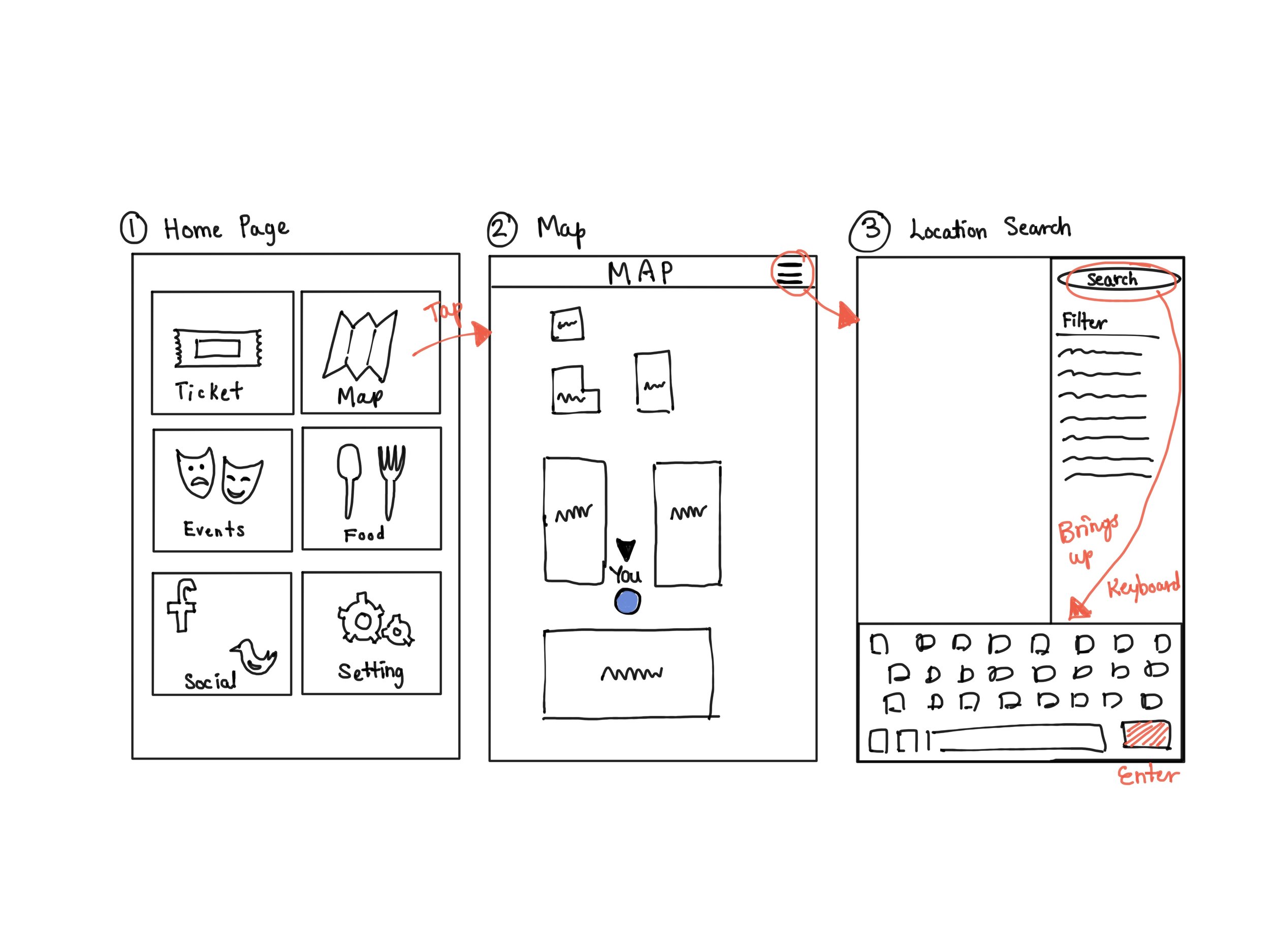
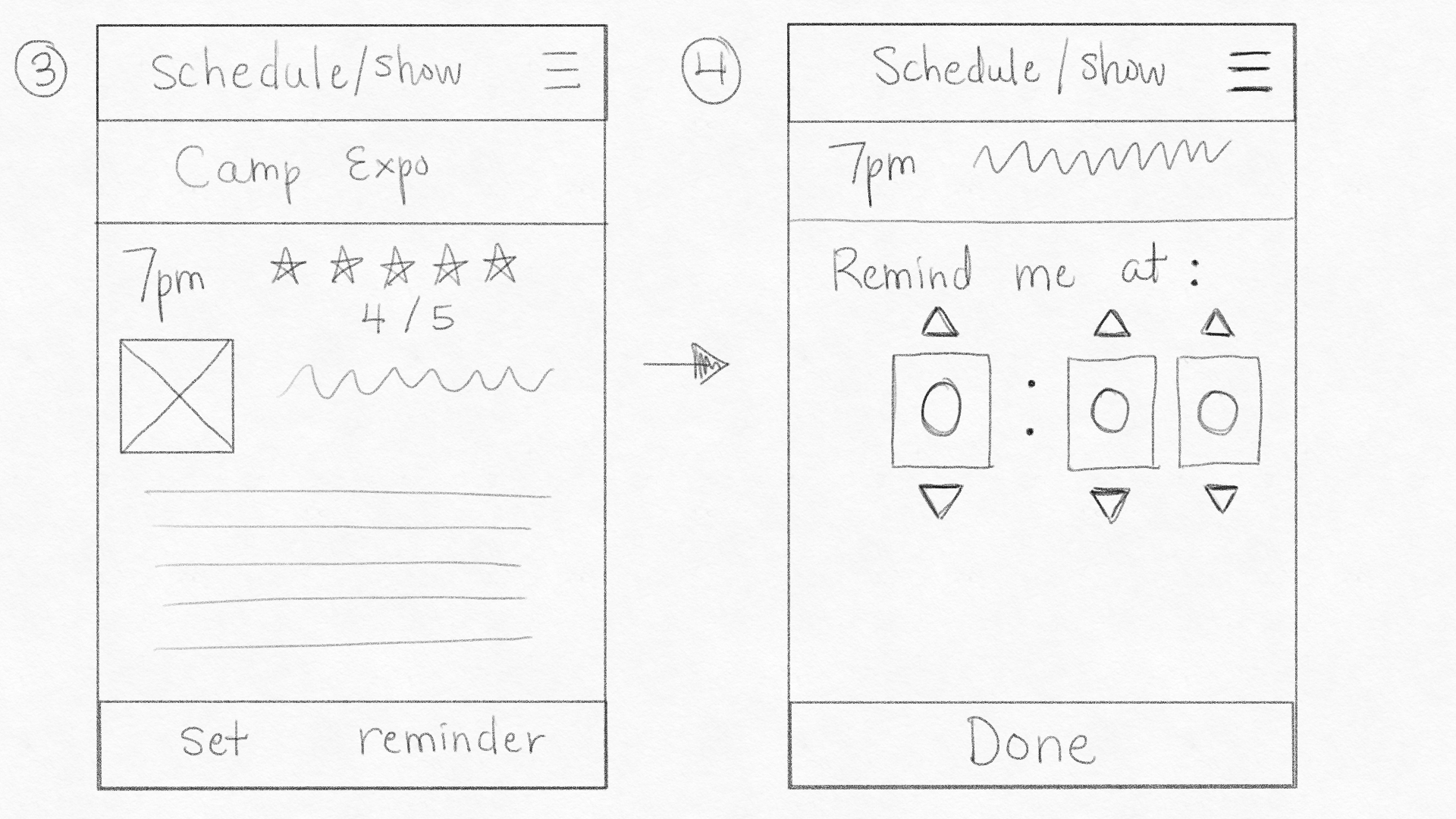
After another round of quick user testing, the sketches were then converted into Balsamiq screens. With this, we started to narrow down on not only button placements, but also the flow of the application as users completed various tasks. The Balsamiq screens are presented below.
Medium Fidelity prototype
We used Figma to create medium and high fidelity prototypes primarily because on top of having the standard prototyping features, it also supported collaboration. We started to pin down the color schema, font, spacing, library, and style guide for the application. The screens are presented below.


Medium fidelity testing - Key feedback
We tested the medium fidelity prototype with 5 users to gain insights and any potential changes that could be implemented to the design of the high fidelity prototype. Following were the key issues with the screens:
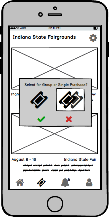
Users needed cue to understand the single and group ticket option.
There were too many screens to schedule activities.
Our aim for quick ticket purchase was not fulfilled as there was no change in time needed to complete the task.
High Fidelity prototype
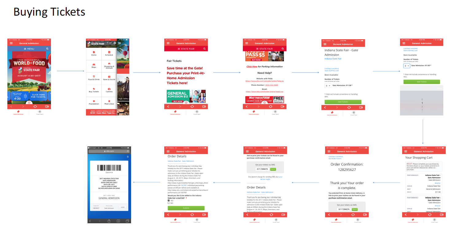
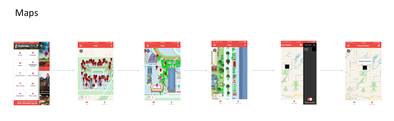
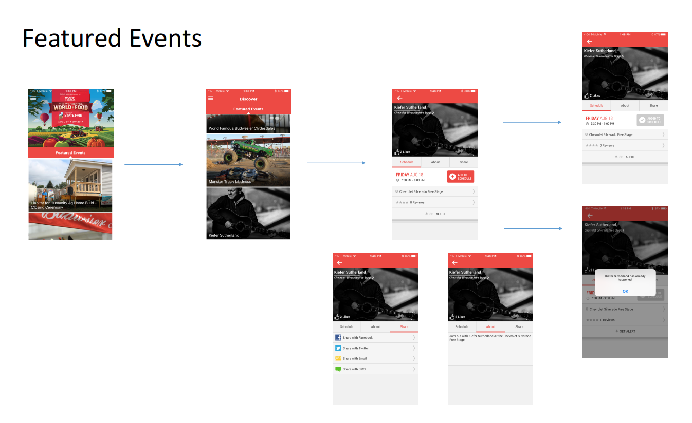
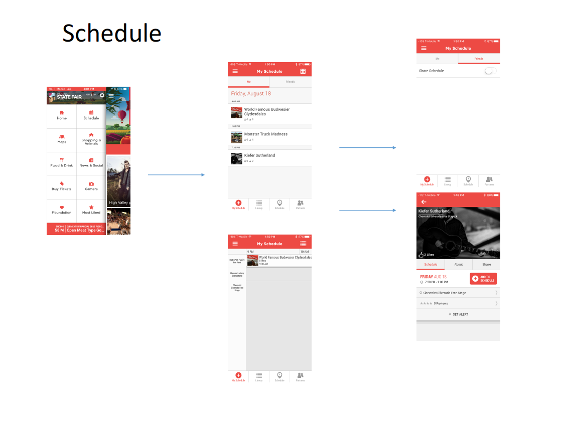
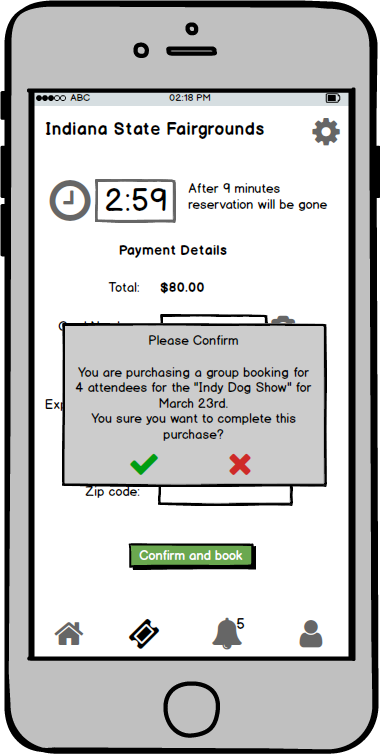
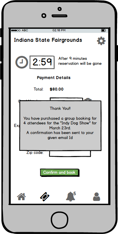
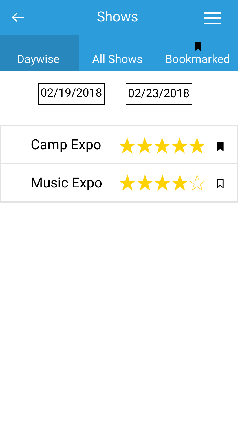
The final high fidelity prototype was designed considering the five key design requirements of buying tickets, navigation, parking, wait times, and information. The following prototype is presented sequentially with each point covering covering screens as related to the particular requirement.
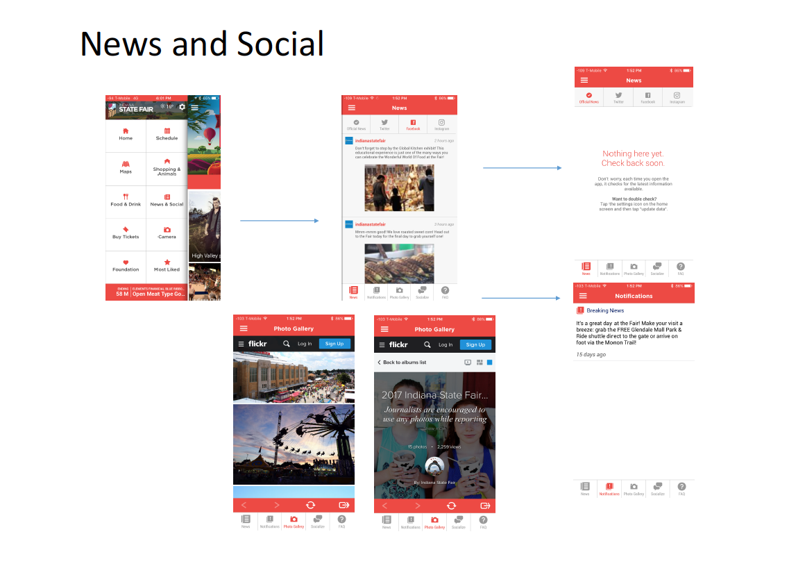
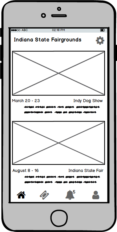
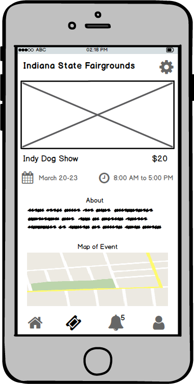
1. Event Information - The screens are designed for simple and easy access to information about the date, event description, and other important details.

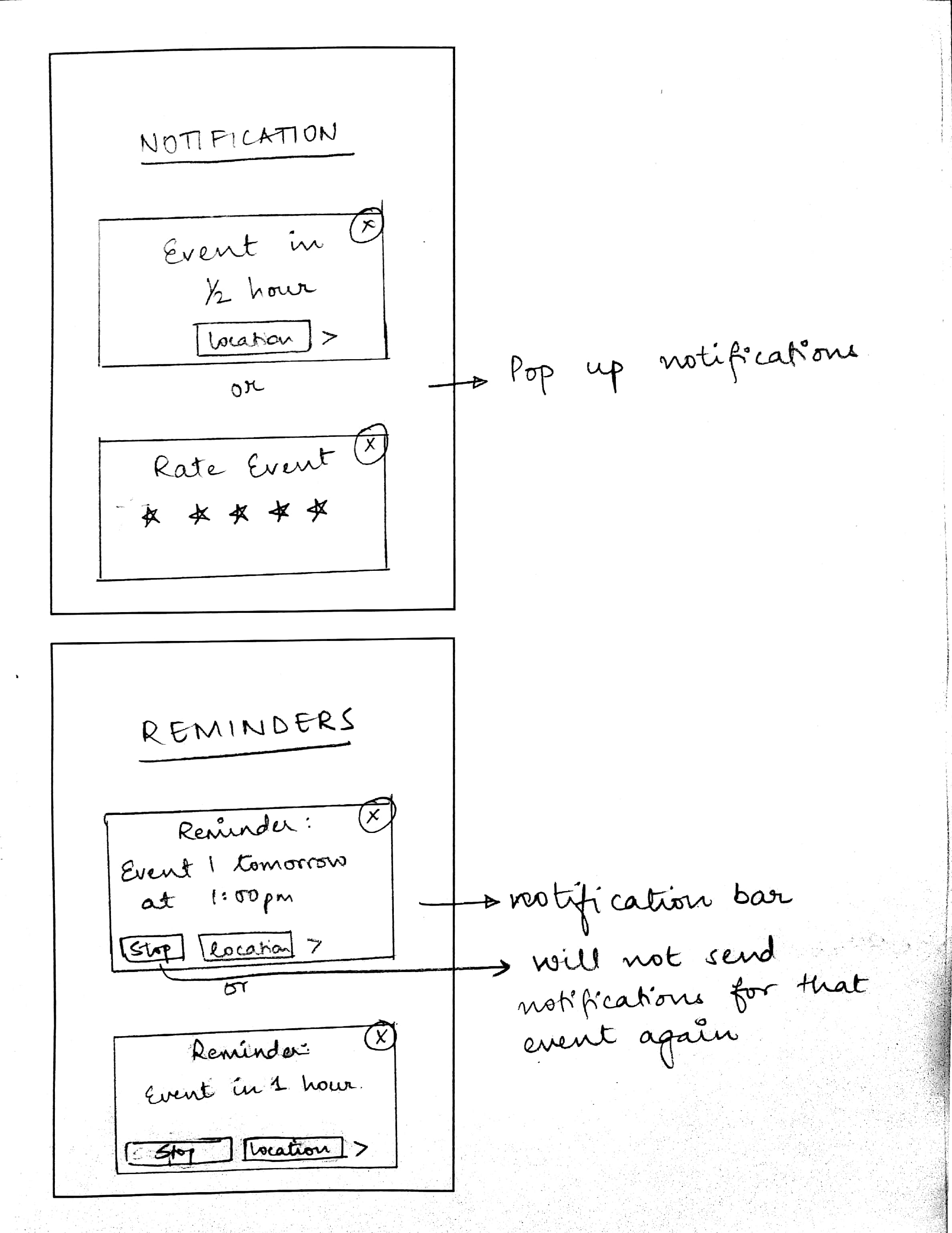
2. Schedules/Bookmarking - Due to the sheer umber of activities, shows, food stalls, and events happening around at the same time, the users were confused and divided over what to attend. Our design facilitated easy display of events by ordered date and time for activities, filter option for categories, and the ability to set reminders.

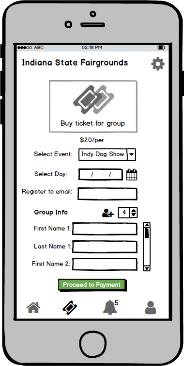
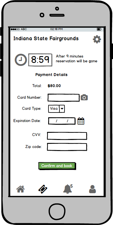
3. Buying Tickets - The primary task of the online ticket purchase with minimal number of screens. A simple three step process, which supports group and family purchase resulted in lesser wait times while online buying.

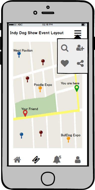
4. Navigation and Parking - The minimalistic map screen was designed to support standard navigation features to avoid confusion, the map facilitated navigation not only to the parking lot but also supplemented navigation inside the event.

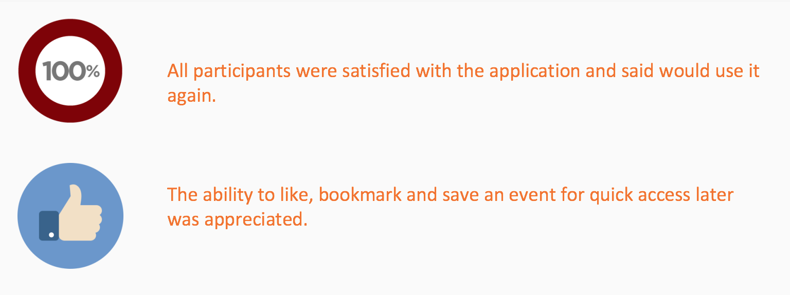
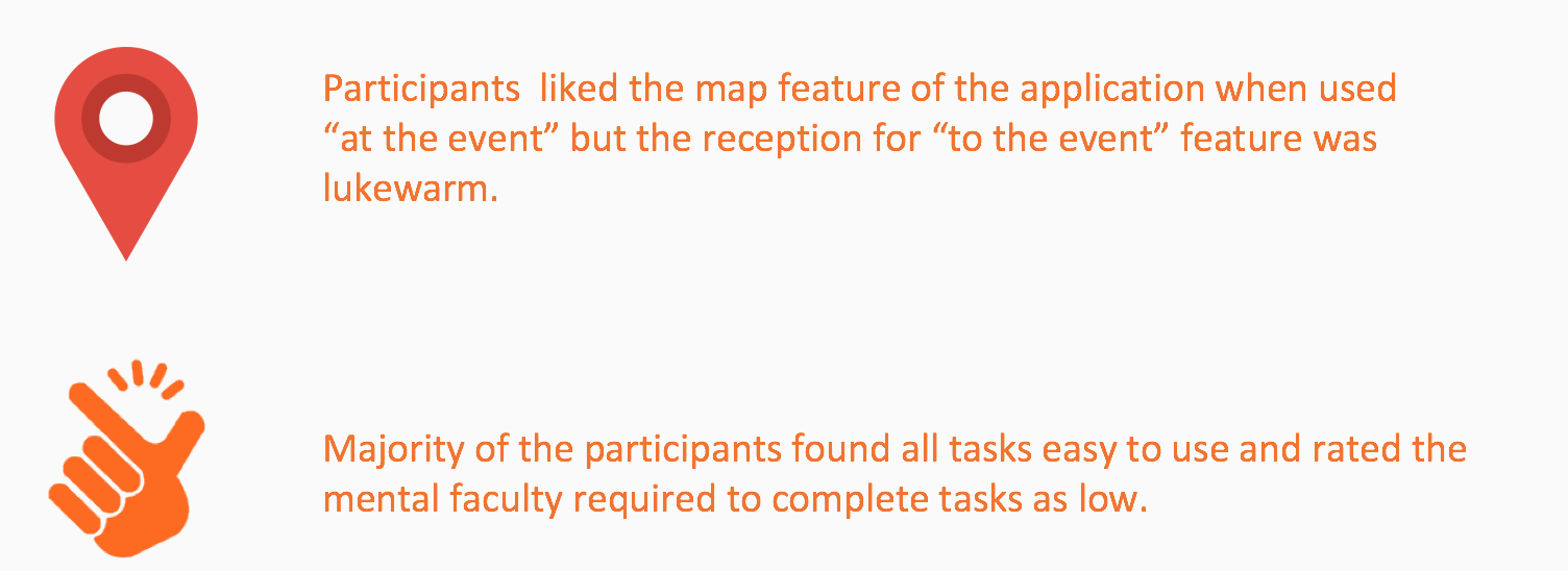
User Testing


Results

Major Themes Observed
Lessons Learned
Think aloud is an effective method to better understand user intentions and thoughts.
Dry test runs are important in order for the real user tests to go well.
Finalize the scope of the project as early as possible in accordance with the time available.
Sometimes, the feedback received from the user can be too little or too vague to be useful. Which could lead to a skewed understanding of user needs.
Be on the same page as the client - We were not able to focus on the organizer side of the project due to initial lack of clarification.
Being in constant contact with the client helped us keep the project on track for the entire duration of the project.