

Nightout
A mobile application to support socializing and support activities
The Challenge
“Design a system to streamline the entire user experience of organizing a night out with friends.”
Context
We are by nature, social animals. Looking for companionship in all that we do. The world is a much easier place to tackle, with friends at our side. Even with the benefit of the internet, it can be a challenge to to co-ordinate among friends and decide on something that everyone is excited about. The project attempts to solve this problem by cutting through the indecision and fallibility by navigating through people's wants and preferences to create a solution that will facilitate social experiences.
User Research
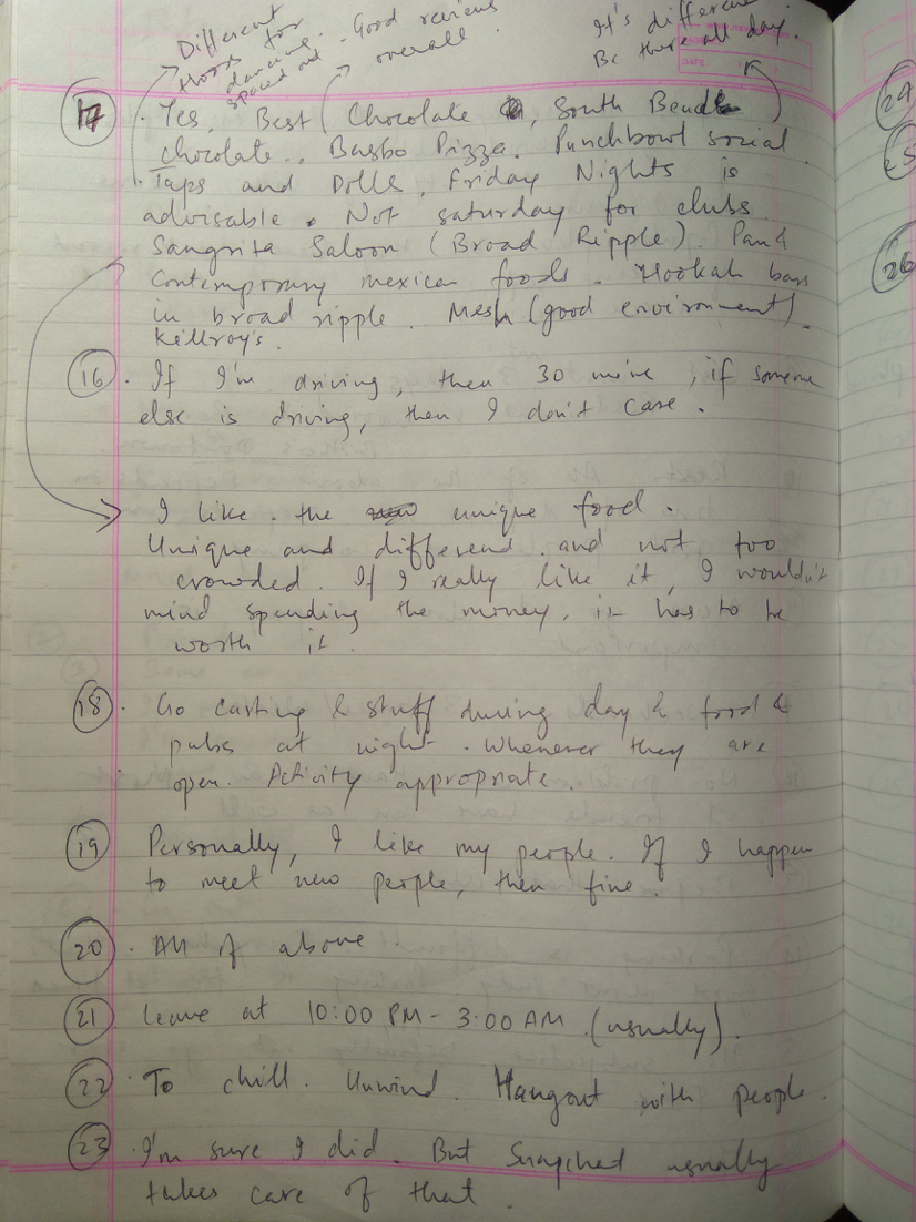
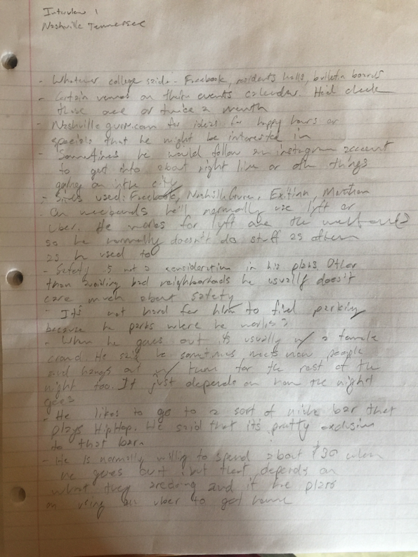
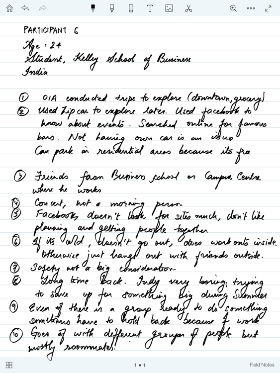
There is a distinctly human element to our project in that it facilitates our need for companionship. As such, it was imperative that understanding the needs and wants of our end users lie at the centre of our design process. Therefore, we conducted a series of user interviews trying to gain an understanding of what "fun" meant to people when they went out.
We chose semi-structured interviews as our preferred method of contextual inquiry. After deciding on the problem space, we discussed and came up with 25 probe points that we felt would best help us elicit the necessary feedback required for a product like ours to function. In order to maintain consistency in our subsequent analysis, all team members, used the same set of probe points to conduct their contextual inquiry.
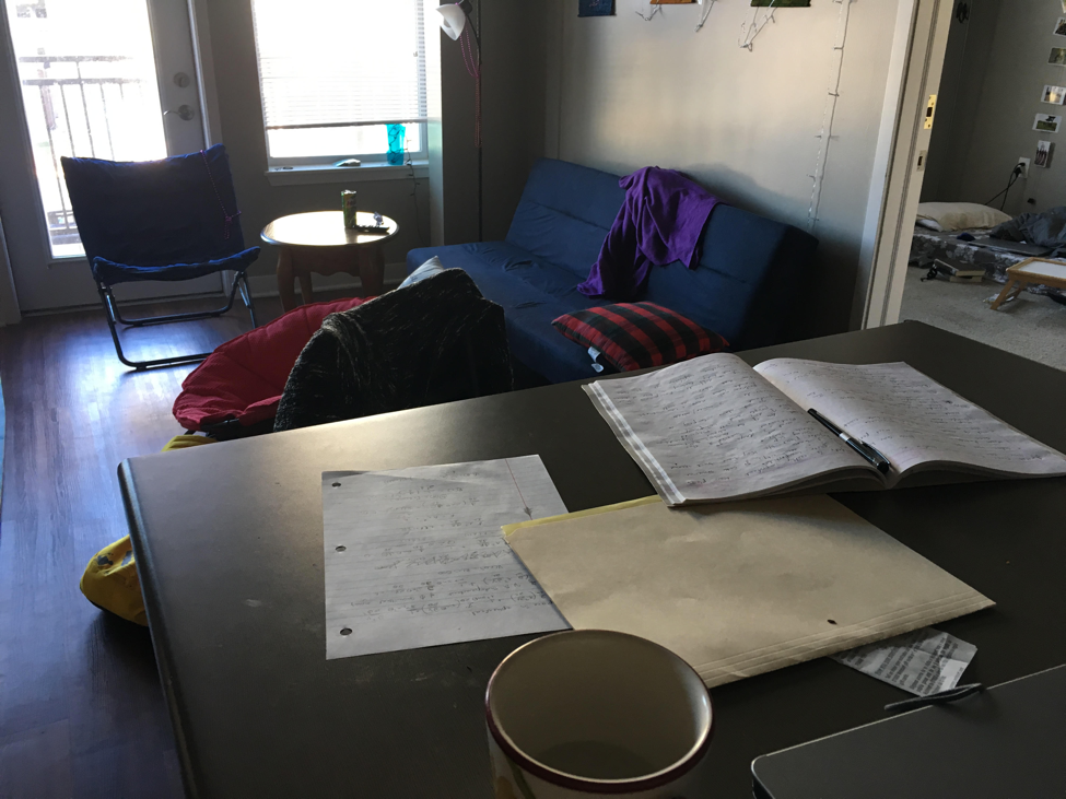
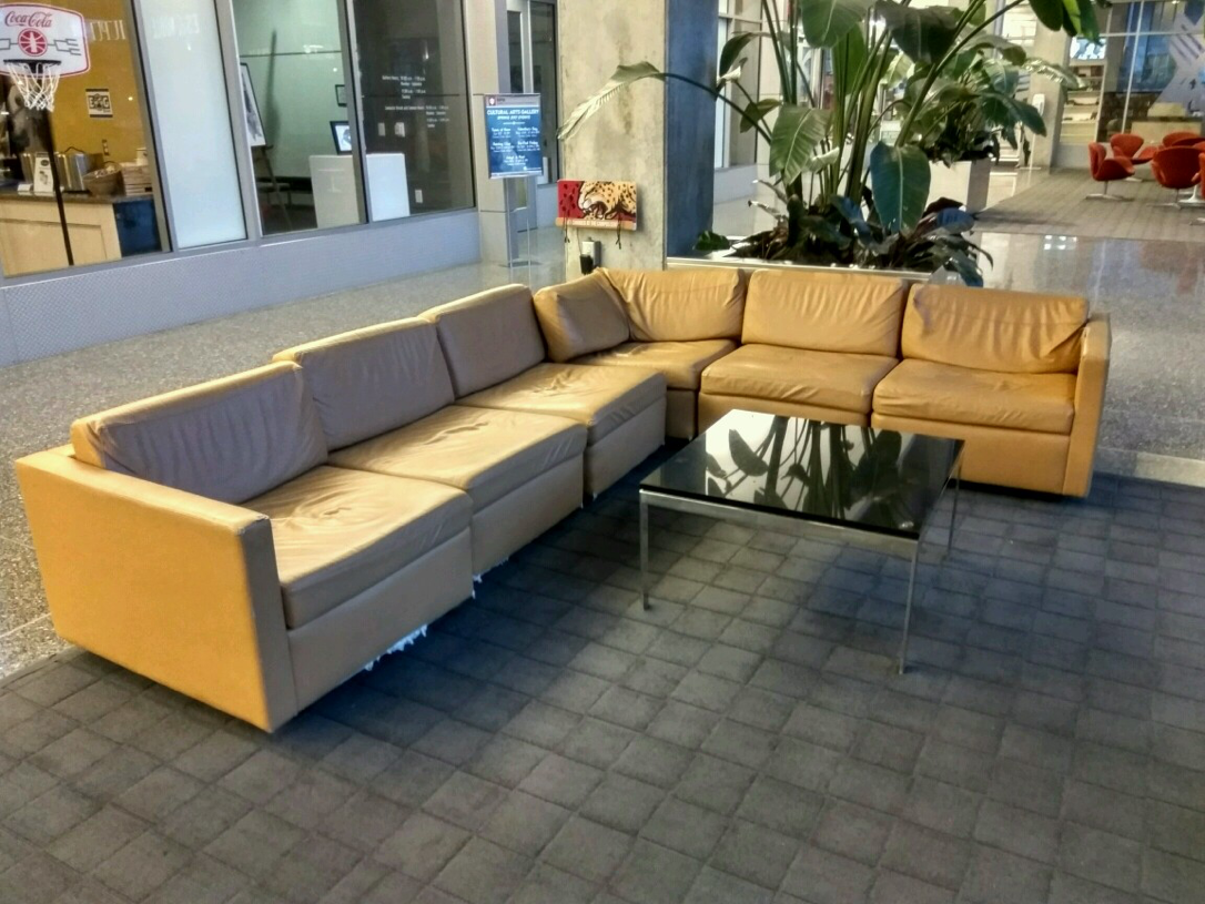
Selected pictures of field notes and the interview location are presented below.
Analysis
Due to the sheer volume of data collected, we decided that it would be best to employ multiple levels of analysis to it in order to get actionable requirements out of it.
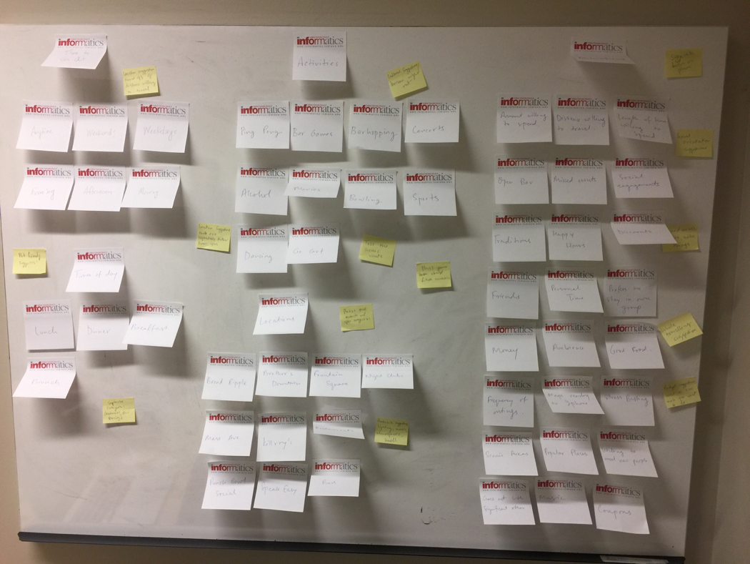
Analysis 1 - Affinity Mapping
The major overarching themes of user research are indexed and categorized using affinity mapping. To get an idea of what "Fun" meant to people, it was important to understand the primary drives of our end users.

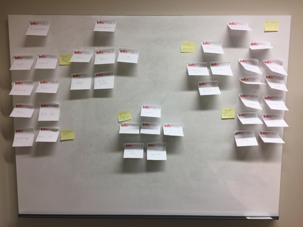
Analysis 2 - Identity Model
We then created an identity model to help clarify the different interests of people, and their priorities when they think of going out into the city.

Analysis 3 - Sequence Model
A sequence diagram was created to identify points where a solution would best benefit the user. The sequence diagram helped visualize two scenarios. The first scenario is for people to find places to visit, and another for someone to go out with a friend.

User Research - Key Findings
While we notice overarching themes that remain common throughout participants, it is important to note that at it's core going out is a social as well as a personal choice and the answers that we got out of our sessions indicate just that.
Word of mouth is the most important consideration before either looking or trying out for a new place. Participants mentioned that there implicit trust about a place or event is much stronger when they hear about it from a friend or colleague.
Going out for the most part is a social activity. Even though most people would plan a night out with friends, family, or significant others, if they find an event that they are really passionate about, they might be persuaded to move out of apathy and attend the event without regards for company.
Transportation and parking are not major issues as most participants either owned a car or used Uber.
De-stressing and socializing is the main reason why most people went out and so most people did not have rigid preferences of what they wanted to do as long as they had the right company.
Participants familiar with the city, hung out with a consistent set of people that they were familiar with.
Potential Design Explorations
Through our learnings, we have understood that people more often find places through ‘word-of-mouth’ than any other medium of communication. A possible reason for this condition could possibly be due to the inability of commercial services to provide digital content that fits into the description of where a user would prefer visiting. Due to the aforementioned reasons, the following recommendations are suggested for areas where design exploration can be productive in creating a solution.
The recommendations are:
Build a mobile app for users to conveniently use and get information.
Understand user interests to suggest the kind of places they would like to visit.
Ideate on a design that merges social ‘word-of-mouth’, with features of other applications such as Yelp that are used to find places.
Understand the reason why users have not adopted to commercial services that help them find places in a city.
Building a mobile/web application is one of the most convenient and technically feasible methods of providing service and hence exploring the concept to act as a medium to help people find places based on their preference is something worth exploring. As ‘word-of-mouth’ communication is extended to communicating through messaging applications, designing a system which integrates messaging with place finding can result in a worthwhile solution to help users find what they look for. As users are expected to be searching for new places to visit, users might expect suggestions that go beyond what is communicated through ‘word-of-mouth’. In such scenarios, it would be helpful if a service could use preferences and past experiences of the user to highlight certain places that he/she could visit.
Ideation
We started our ideation and brainstorming process by very much keeping the data insights in mind. As such, we "walked the data" and came up with 20 ideas that we thought were viable solutions to out problems.
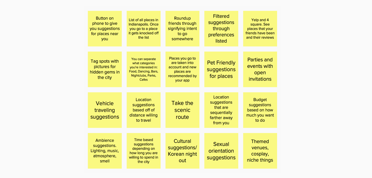
20 ideas generated after "walking the data".
Since we had been working so extensively with the data during the analysis, we found ourselves believing that, because of continuous interaction, we could have become bias or become attuned to a certain type of thinking. So to eliminate homogeneity and to include a more diverse range of brainstormed ideas, we "walked the data" with an external UX professional. This was done primarily to get a fresh viewpoint.

External person "walking the data".

10 ideas generated through the external person "walking the data".
A total of 30 brainstormed ideas were filtered down to 3 potential systems that tried to solve aspects of the shortcomings outlined in the problem space. The three systems were as follows:
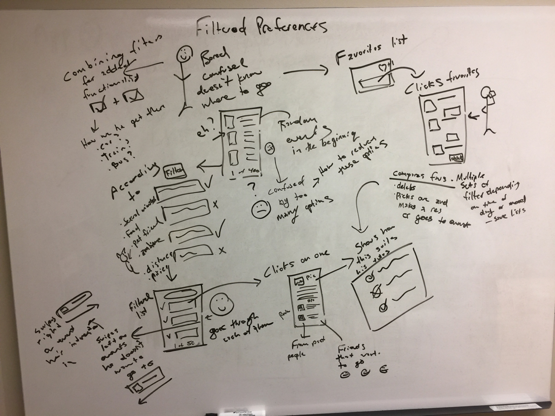
Preference System - This system provides the user with a means of updating their tastes and preferences within the application. This would allow the user to continually update the application according to what they are enjoying at the moment. If a user did not particularly enjoy a restaurant they went to recently, they could specify on the application that this place was not to their liking. Once they do so, future suggestions will take into account certain features of that restaurant, so as not to suggest places similar to it in the future.
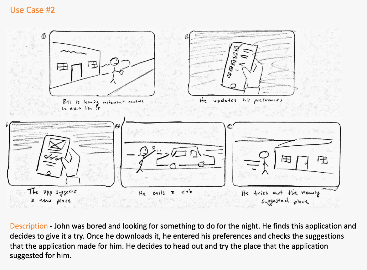
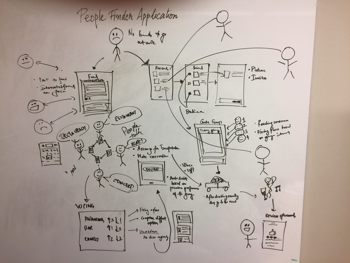
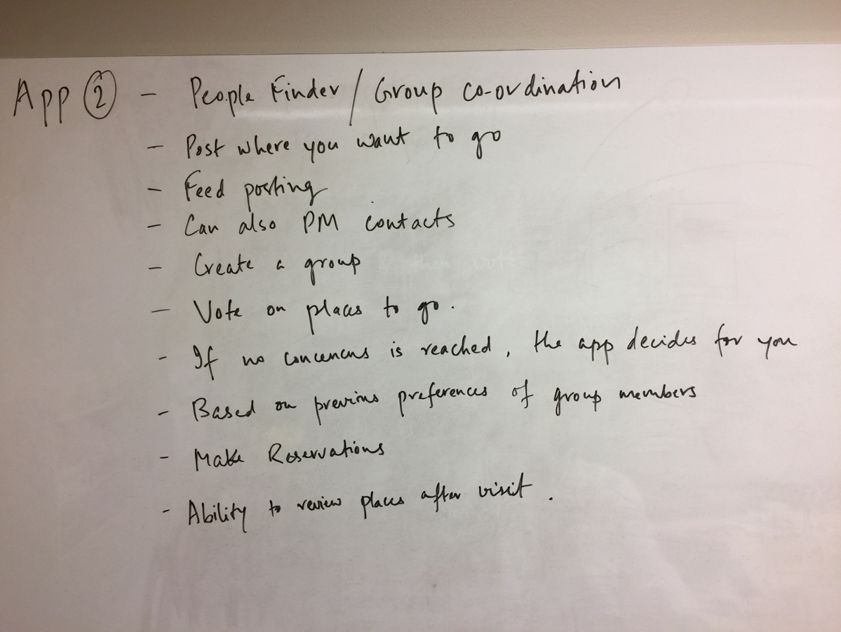
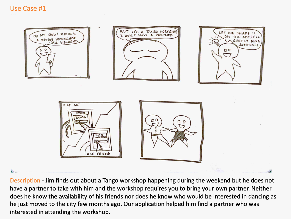
People finder/group collaborator system - One major reason that dissuaded people from spending their weekend outside was finding the right company to go out with. Checking people’s availability, debating on what to do and reaching a consensus seemed onerous enough to prefer staying in. This system resolves the issue by making it easy to find out what the user’s friends are up to or for the friends to indicate their availability and interest for something the user is interested in. It also aids in the decision-making process within a group.
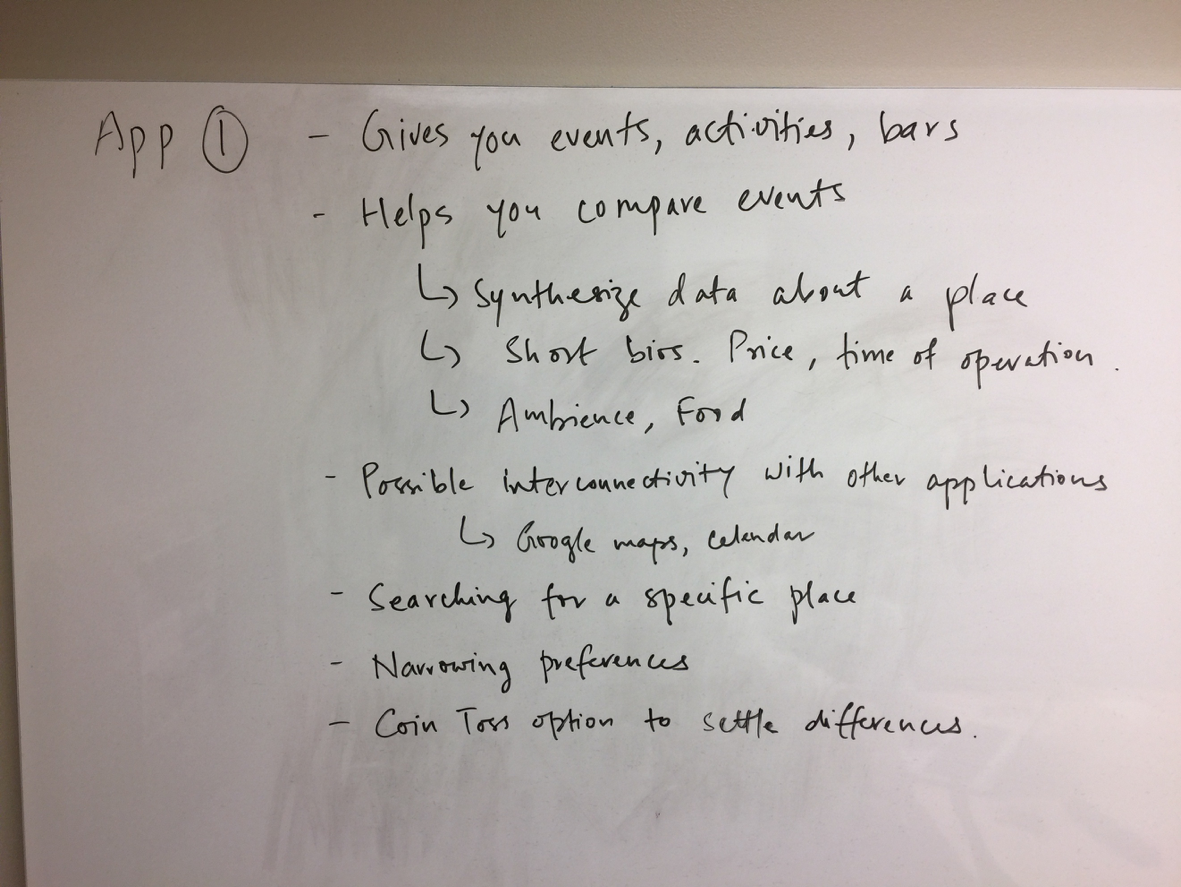
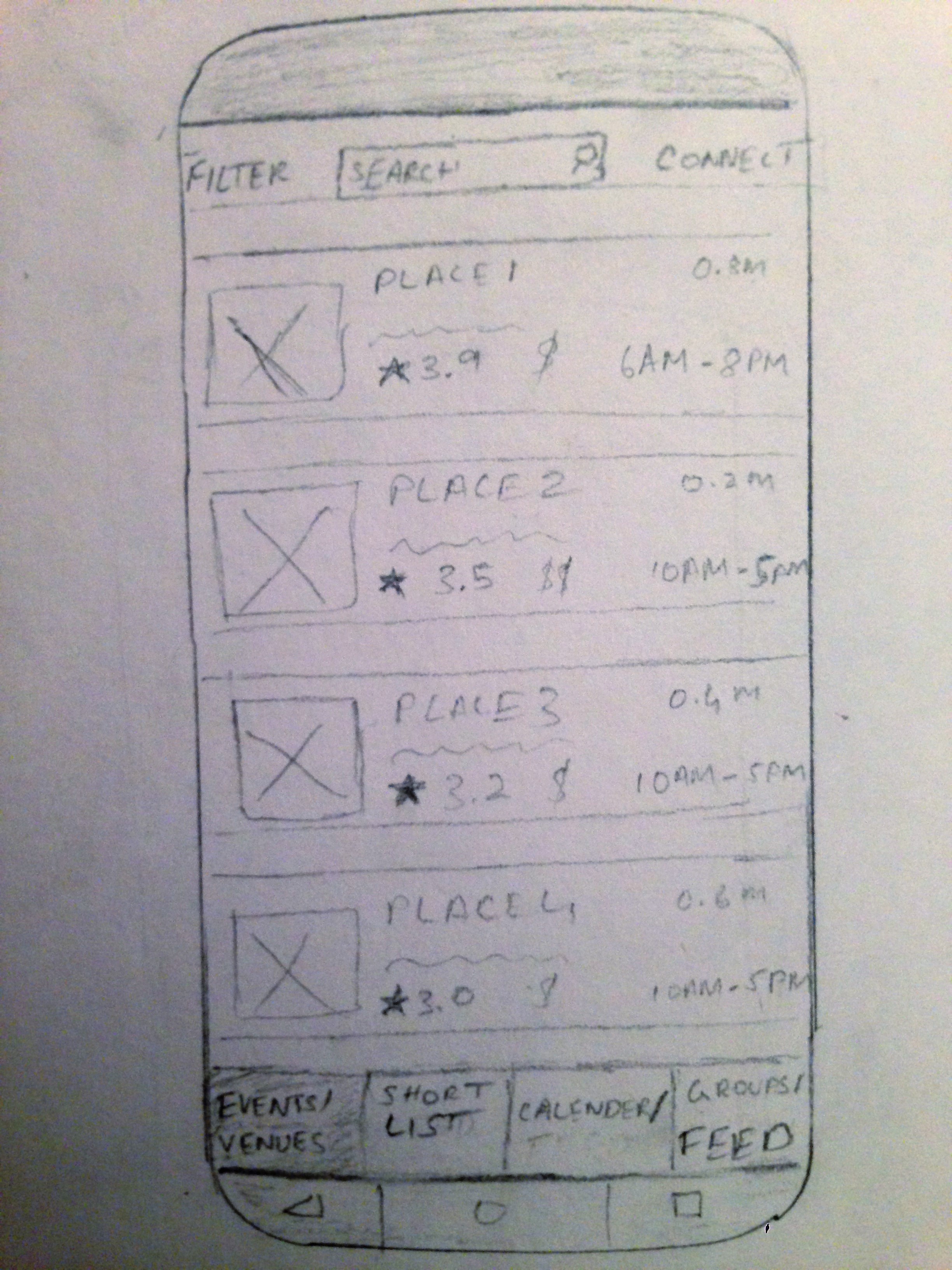
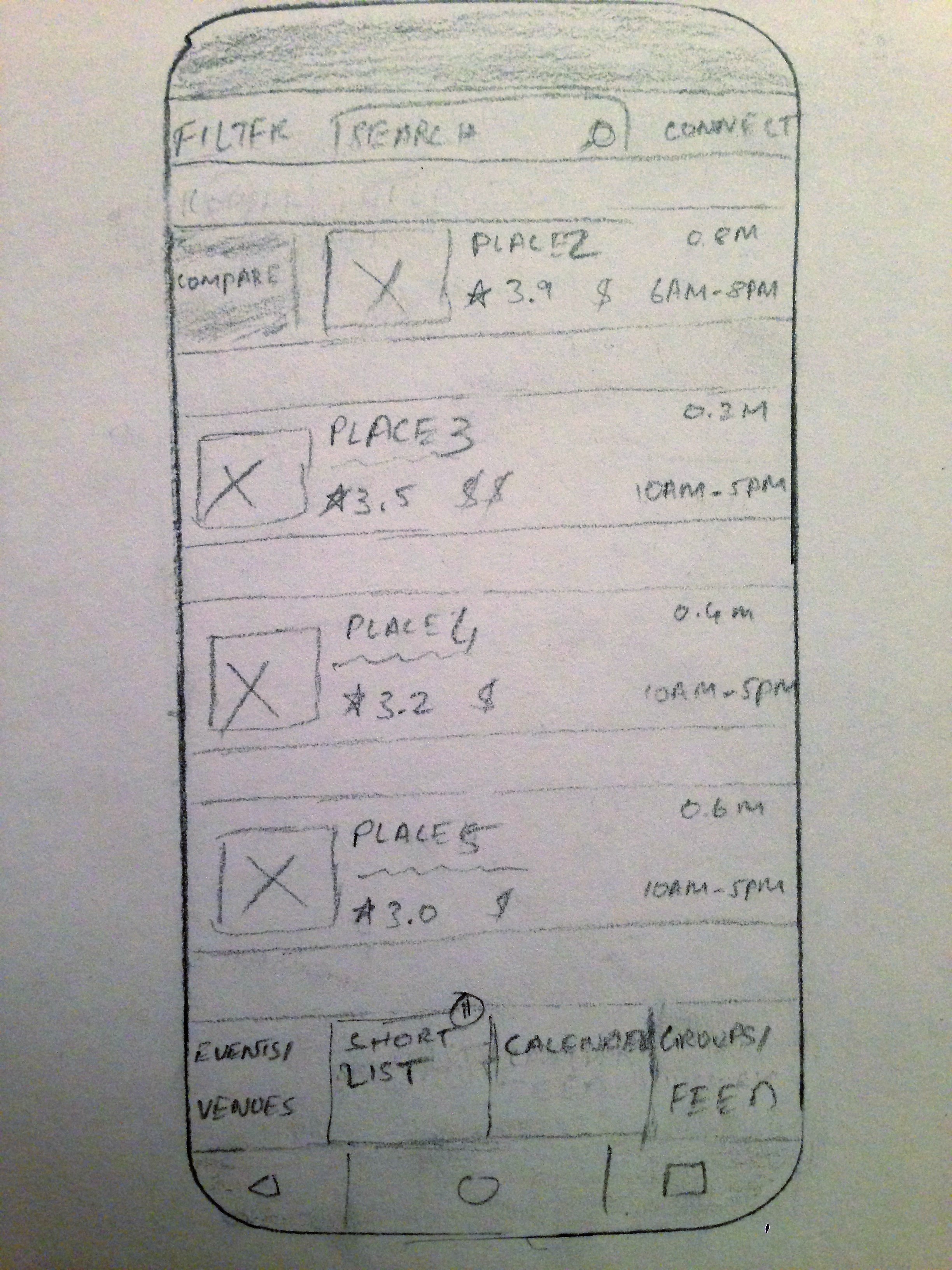
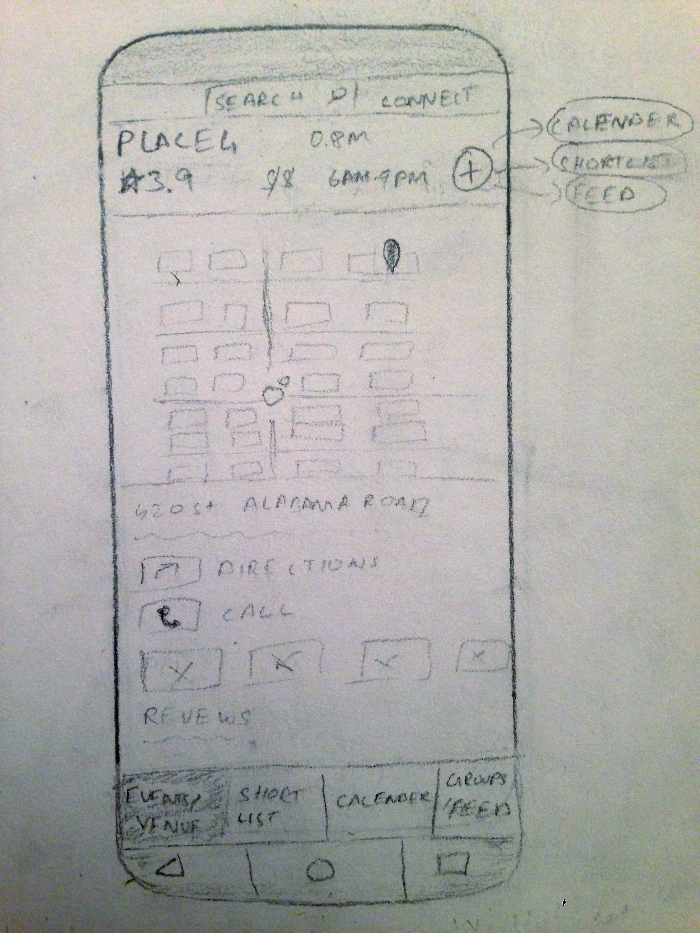
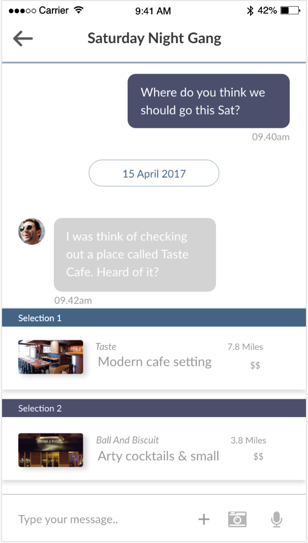
Activity Finder System - The system comprises of a variety of events/ activities/ venues across the city into a list, sorted based on categories for users to view and select based on their interest. Selecting an item within the list will detail information about each event and other useful details that can help guide the user’s decision to visit a venue. Details will include ‘factors’ such as the pricing, time people spend there, ambiance, food etc. of each venue. The system provides the functionality of being able to compare ‘factors’ of one item, with the ‘factors’ of other items in the list that the user might be interested in.
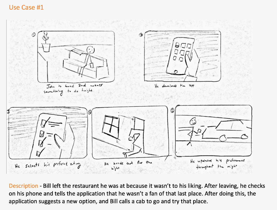
Visioning and Storyboards
We then sketched out the vision of all 3 systems. Which is to say that we tell the story of a potential user as they go about using the system and complete a task in a likely scenario. The conclusion of the visioning workshop for each system was followed by exploring 2 user cases that were expressed in the form of storyboards.
Preference System
Visioning workshop
Storyboards
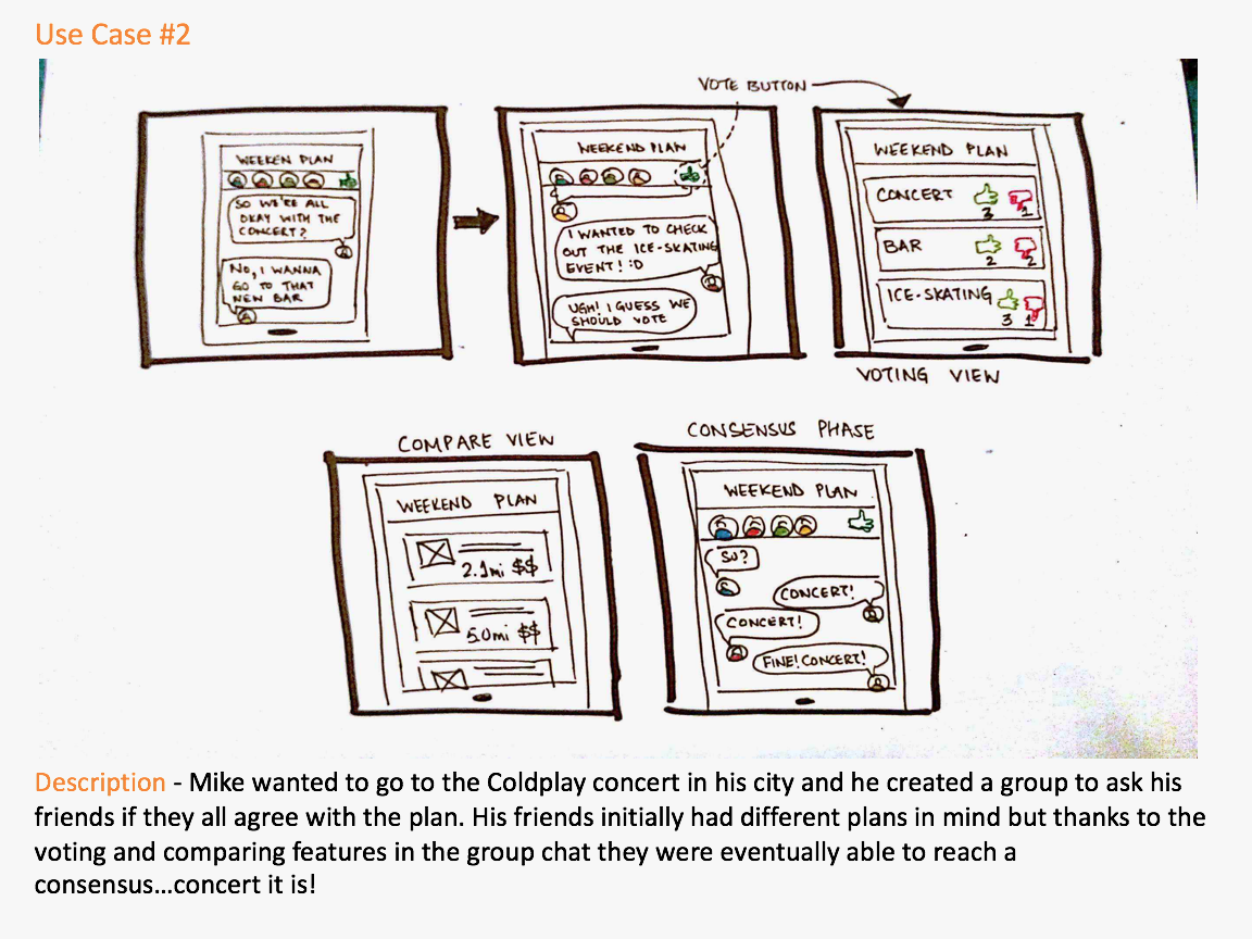
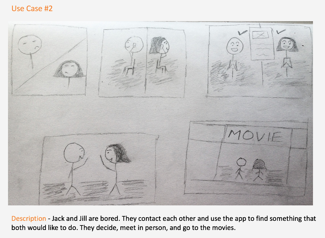
Collaboration System
Visioning workshop
Storyboard
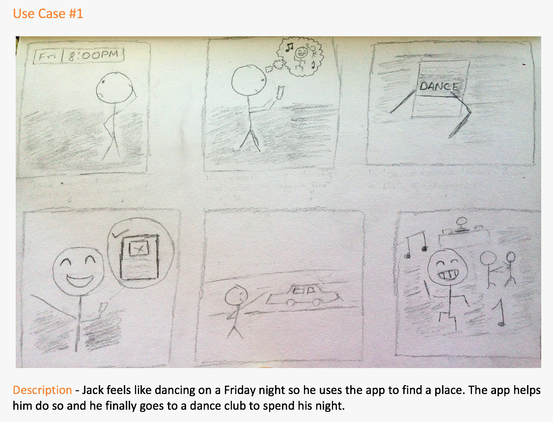
Activity Finder System
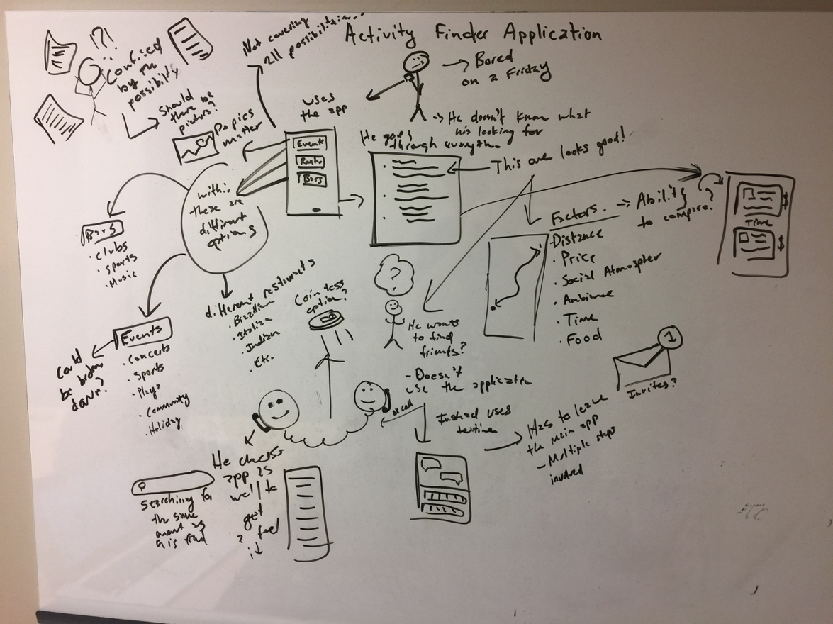
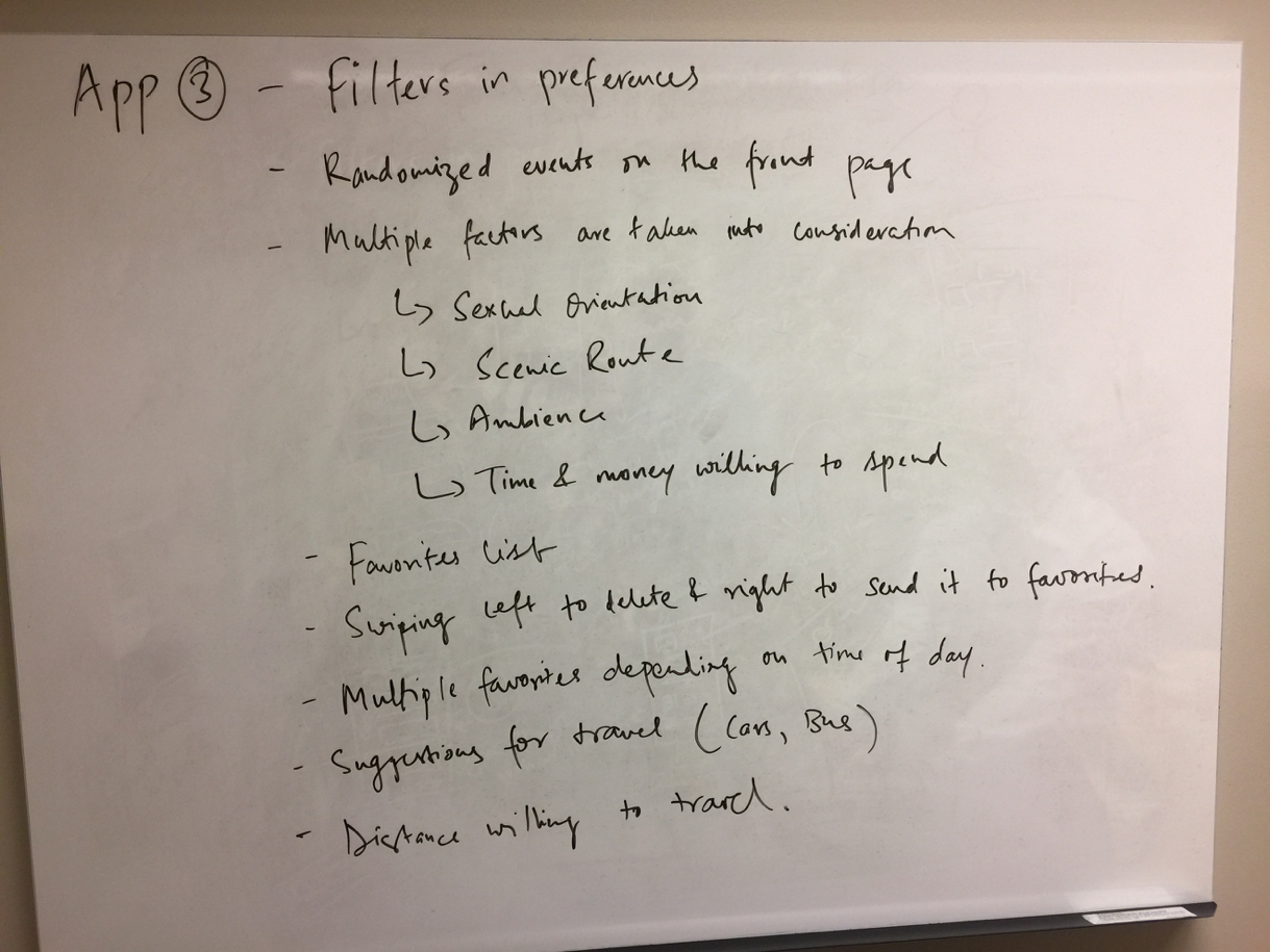
Storyboard
Final System
The systems were chosen after analyzing the data collection process and depict the three main hinges on which the activity of “going out” turns. Therefore, choosing just one, or even a subset of the three systems would constitute a final product, which falls short of having the critical functionality for a product like ours to properly function. At the same time, being inclusive of all functionalities from all 3 systems is not technically feasible and contributes towards unnecessary cognitive load on part of the user. Our design problem states that “People don’t have the necessary knowledge, motivation, and information to be able to maximize their night out’s”. Based on the data gathered from our contextual inquiries, we have chosen to include core functionalities, which tackle the above mentioned design problem. The proposed system will have
A survey to get to know the user
Simple descriptions of the locations suggested
Ability to check places that you don’t enjoy, and preferences will update accordingly.
Ability to pick the “scenic route” to destination.
The user’s economic preferences.
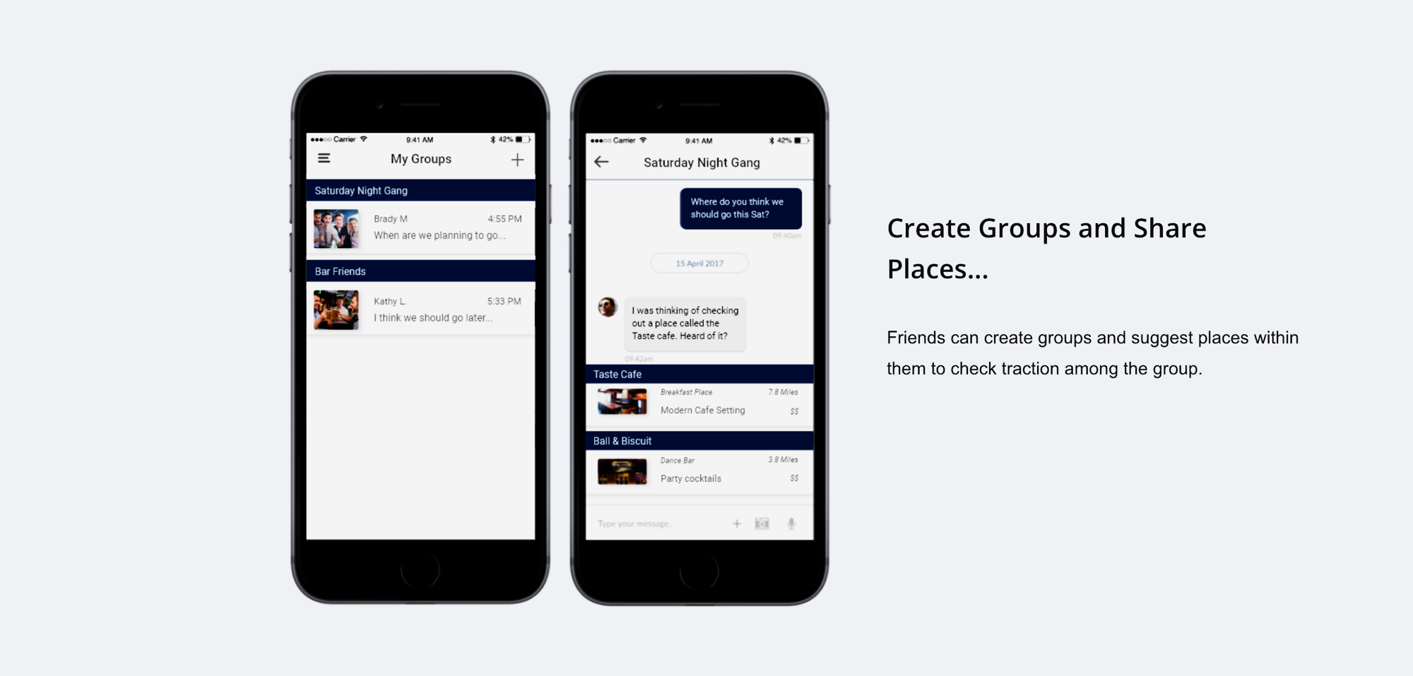
Users can share an interested place/event, that they would like to visit/attend during the weekend, to a “feed” from where their friends can mention if they are interested in it too.
There is also a feature to compare these suggestions based on proximity, cost, ambience and other factors.
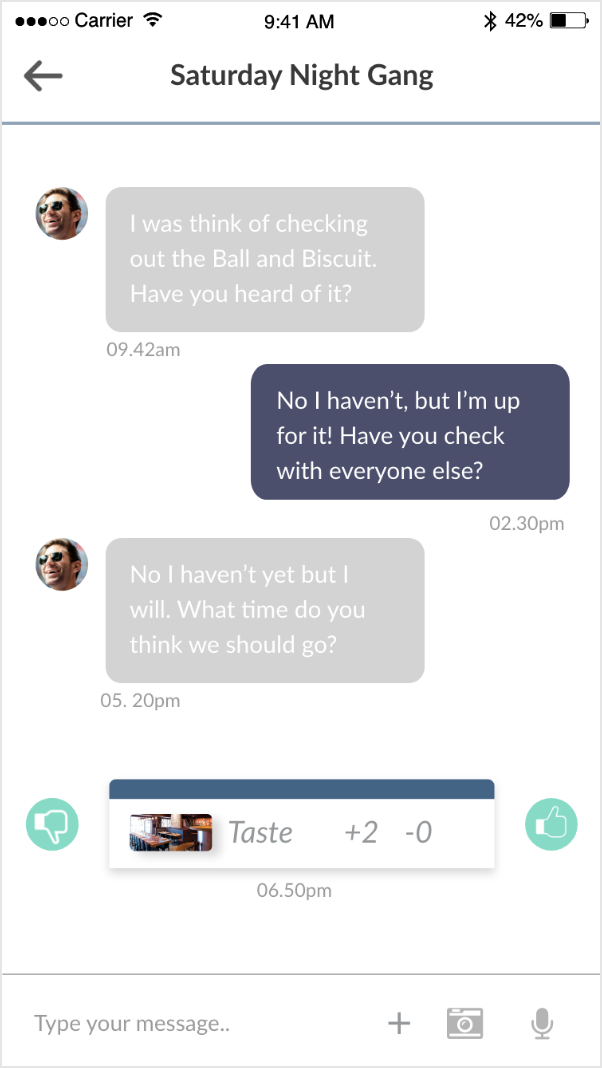
If there is no clear majority, there is an option to let the app decide for the group based on each individual’s previous preferences.
If the group does not have access to transportation the app also suggests bus/metro routes to take to reach the place, in addition to the option of booking an Uber.
A group is automatically created with the people who have shown interest in your post. The members can be changed later as well.
Additionally, user can also send a personal message to any particular friend sharing the details of the place/event.
Comparison between venues.
Integration with maps and calendar applications.
The proposed system lies at the confluence of personal, social, and motivational satisfaction and therefore successfully tackles all the problems identified during the contextual inquiry process. Theoretically, it checks all the boxes for a system like this to successfully function, but it should be noted that it’s true mettle remains subject to user testing after prototyping.
Prototyping
We followed an iterative agile methodology to cycle between stages of prototyping and user testing. Where each stage of prototype was tested and the results would go on to inform subsequent prototypes. To make sure that the proposed system caters to the core design requirements and for the results of testing to be viable, we decided to test prototypes on the three main tasks that the system is expected to facilitate. This also has the additional benefit of maintaining constancy throughout the process. The three tasks were:
Compare two events
Post an event on someones feed
Vote for an event in the "group decision" mode.
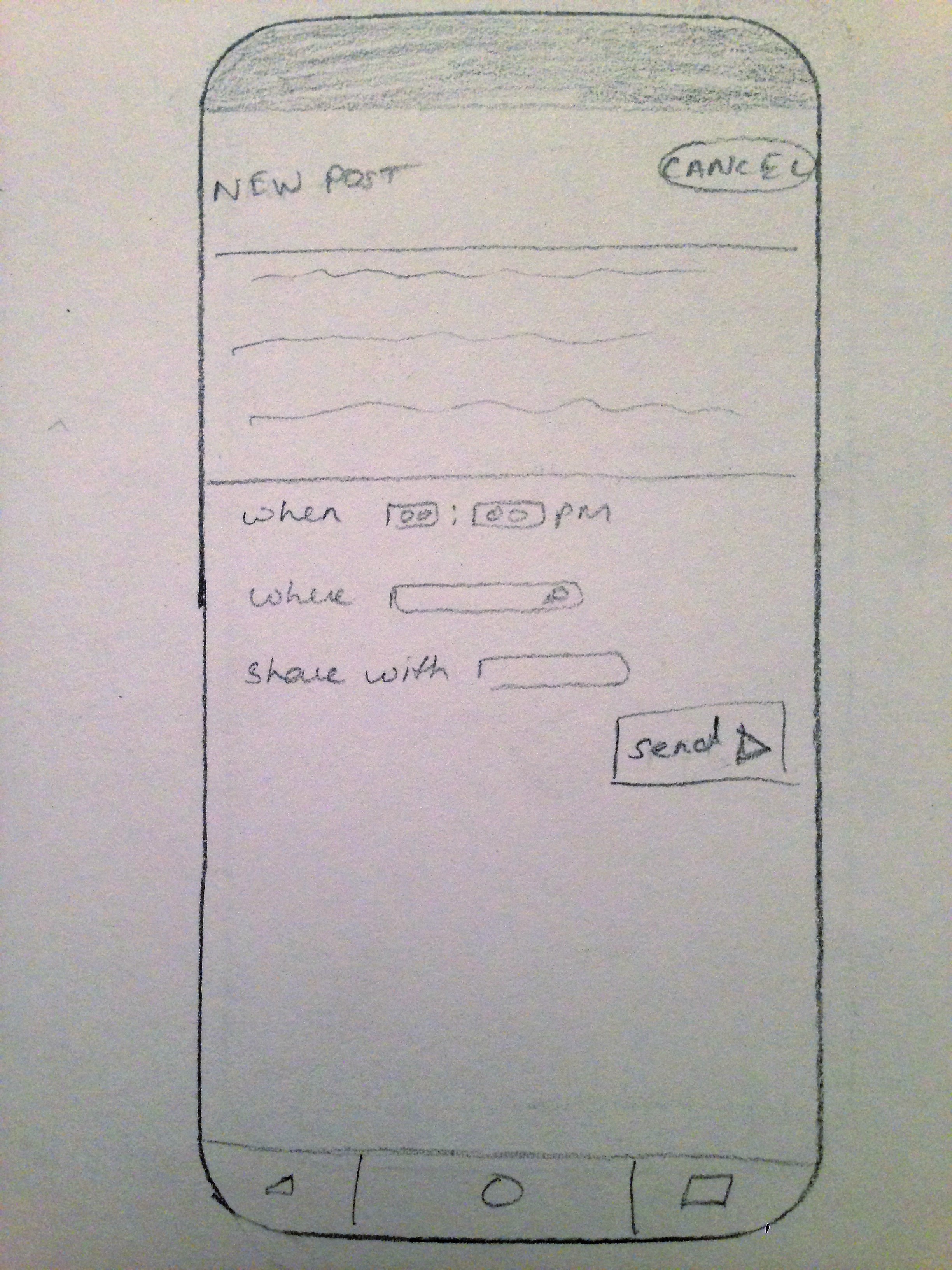
Low-Fidelity Prototype
Putting pencil to paper, the low-fidelity prototype was simply a sketched out version of the aforementioned design requirements. The screens are presented below.

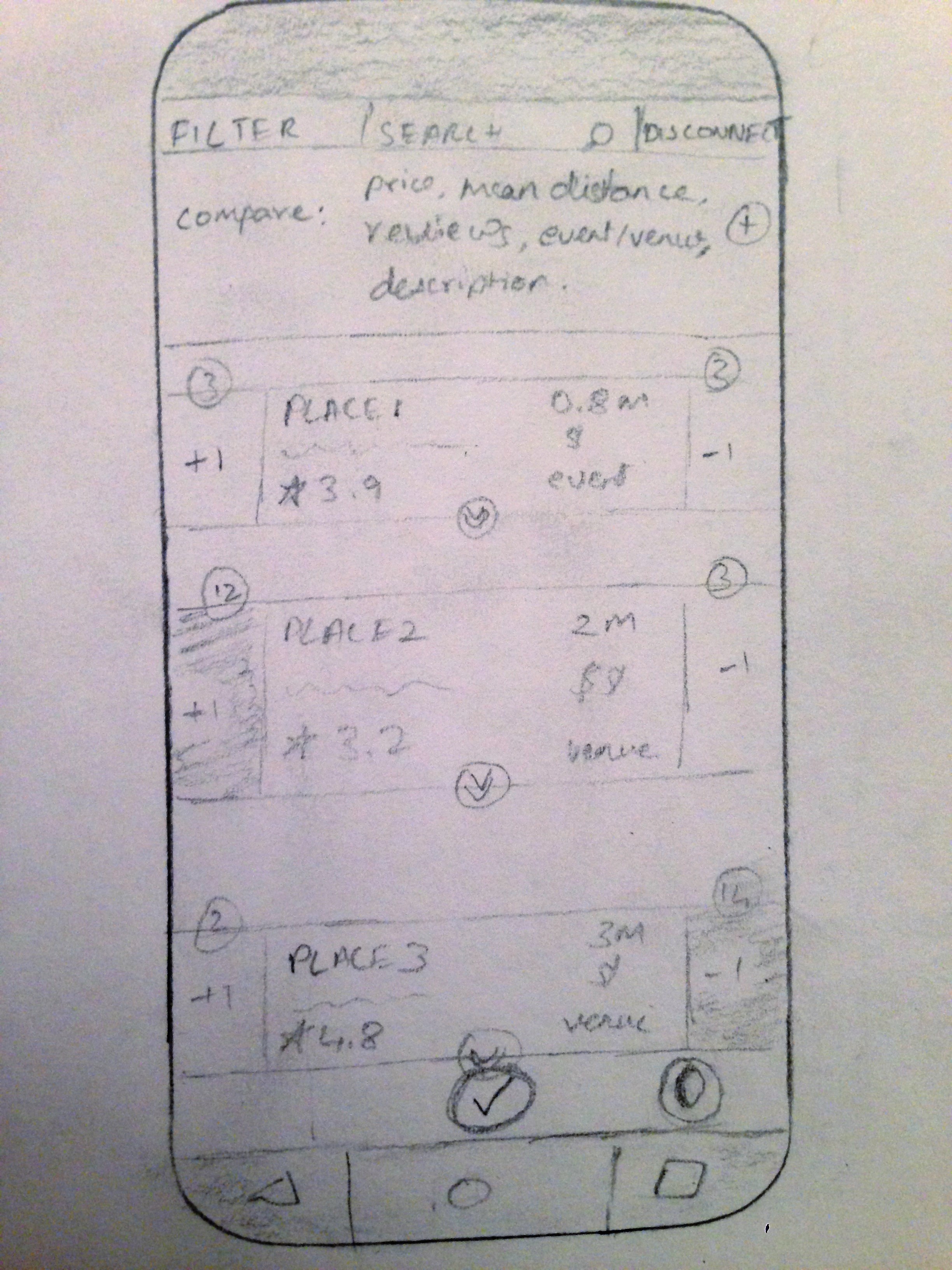
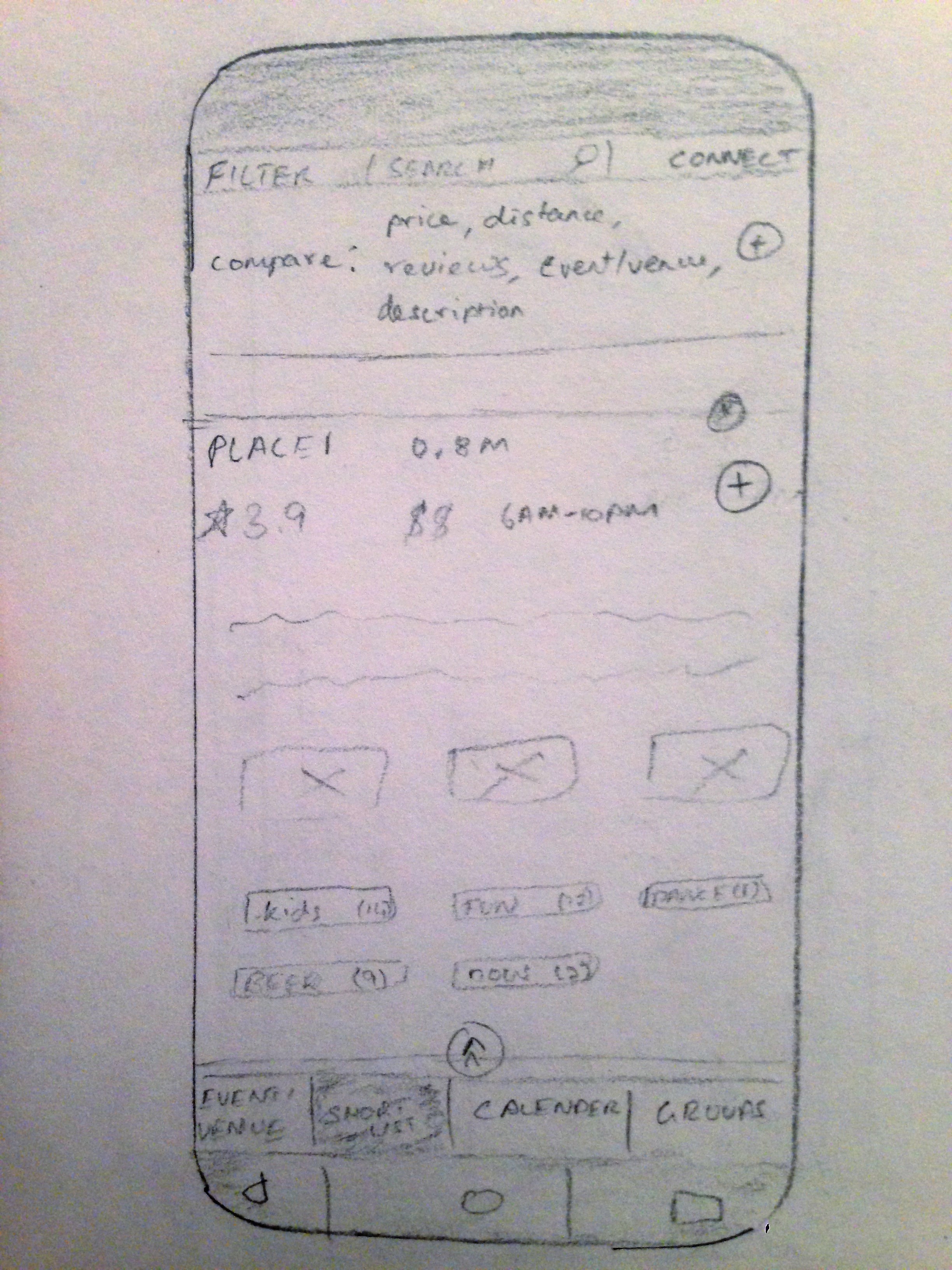
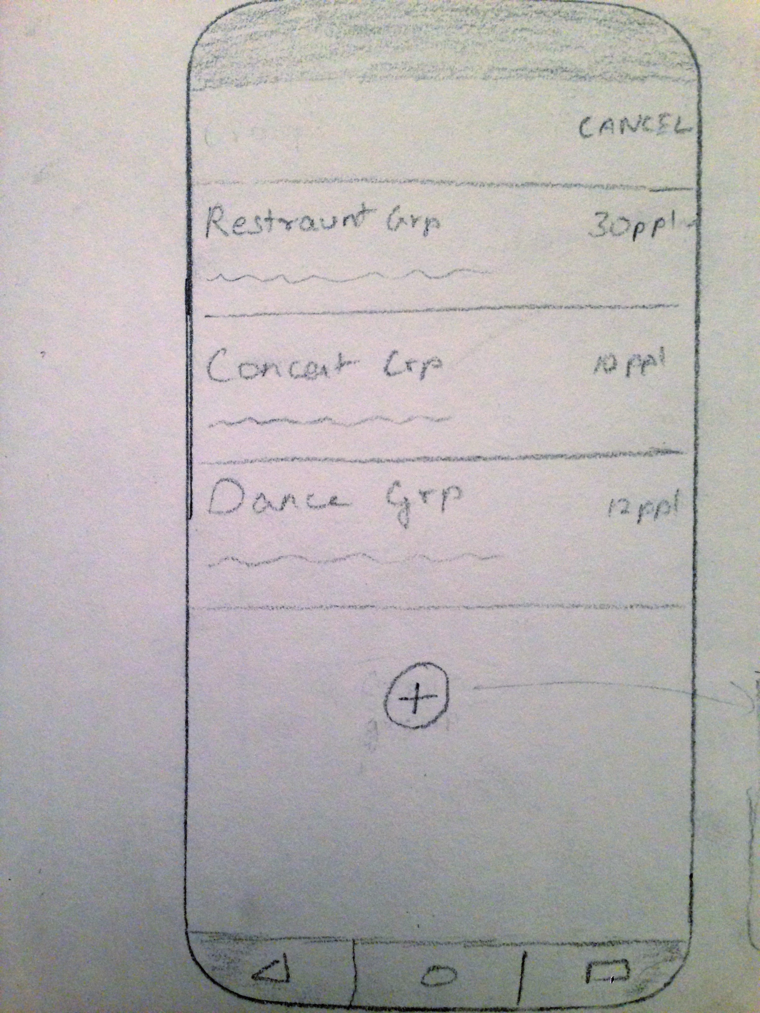
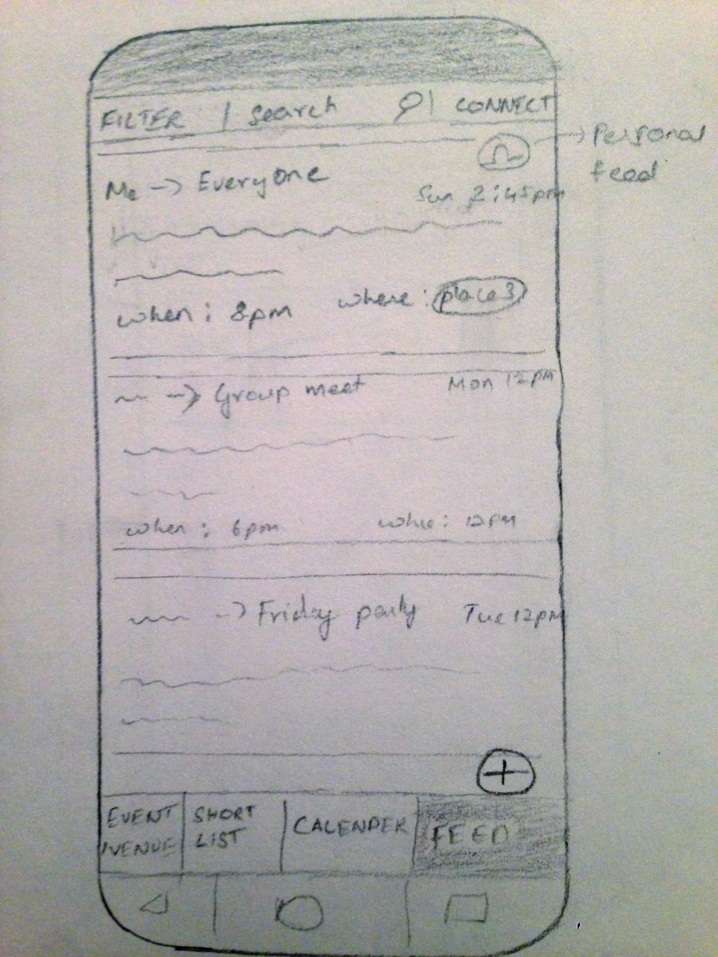
Usability Evaluation (Paper sketches)
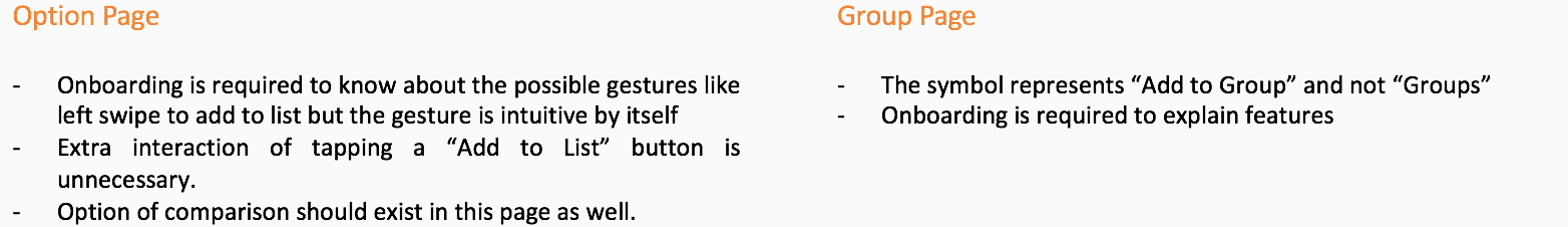
To simplify testing, simple feedback for actions such as ‘swipe’ and ‘select’ were executed through the ‘Wizard of Oz’ technique. The prototype of the system incorporated certain features that are novel to the user, such as the feature to compare multiple events, and it took some effort from the participant to understand the working of the system. This emphasized the need to simplify functionality. If the working of the application cannot be simplified to remove the user's cognitive load, on-boarding might be required to guide the user in his first go. The two options would have to be explored.
Although the novelty of the system was not lost on the user, given the extremely low fidelity nature of the prototype, certain unusual functions such as “compare” took some effort to understand.
Additionally, the incorporation of minimalistic icons, although an intuitive design choice led to some confusion on part of the user. Although challenging to understand in the beginning, trial and error, screen placement, and context of use quickly allowed the user to understand the intended reactions to their respective button actions.
Even though this was just a rudimentary representation of our final product, we noted complaints about the sheer number of options to choose from and the related cognitive load.
While the participant could compare price, description, and distance, participants preferred being able to compare reviews of venues as well. The next iteration would incorporate this feature. On trying to connect the application to ‘group mode’ participants found the steps to be complicated. This might have to do with the prototype design rather than the actual steps the participants had to take as the paper prototype might have to be more creatively designed to help users understand the interaction. Such issues can be fixed with higher fidelity.
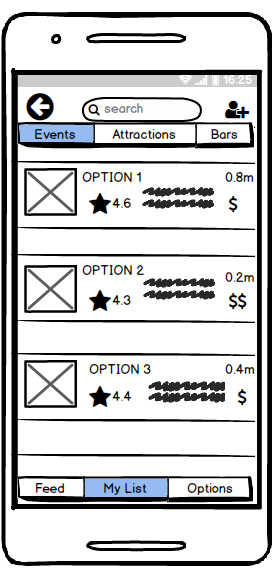
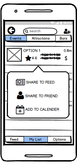
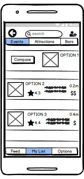
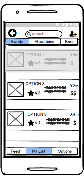
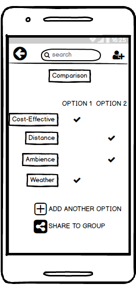
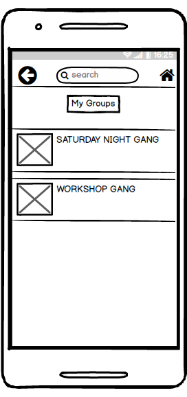
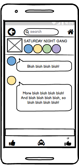
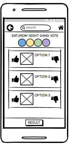
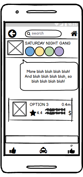
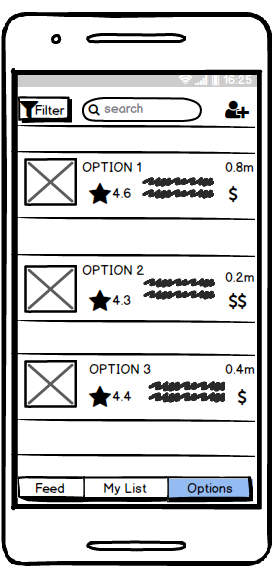
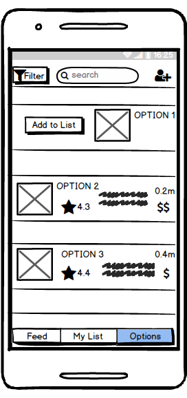
Medium Fidelity Prototype
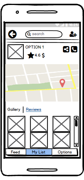
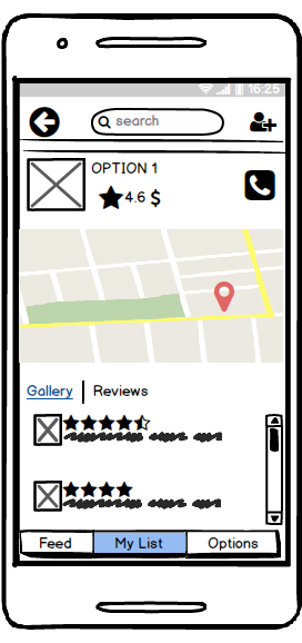
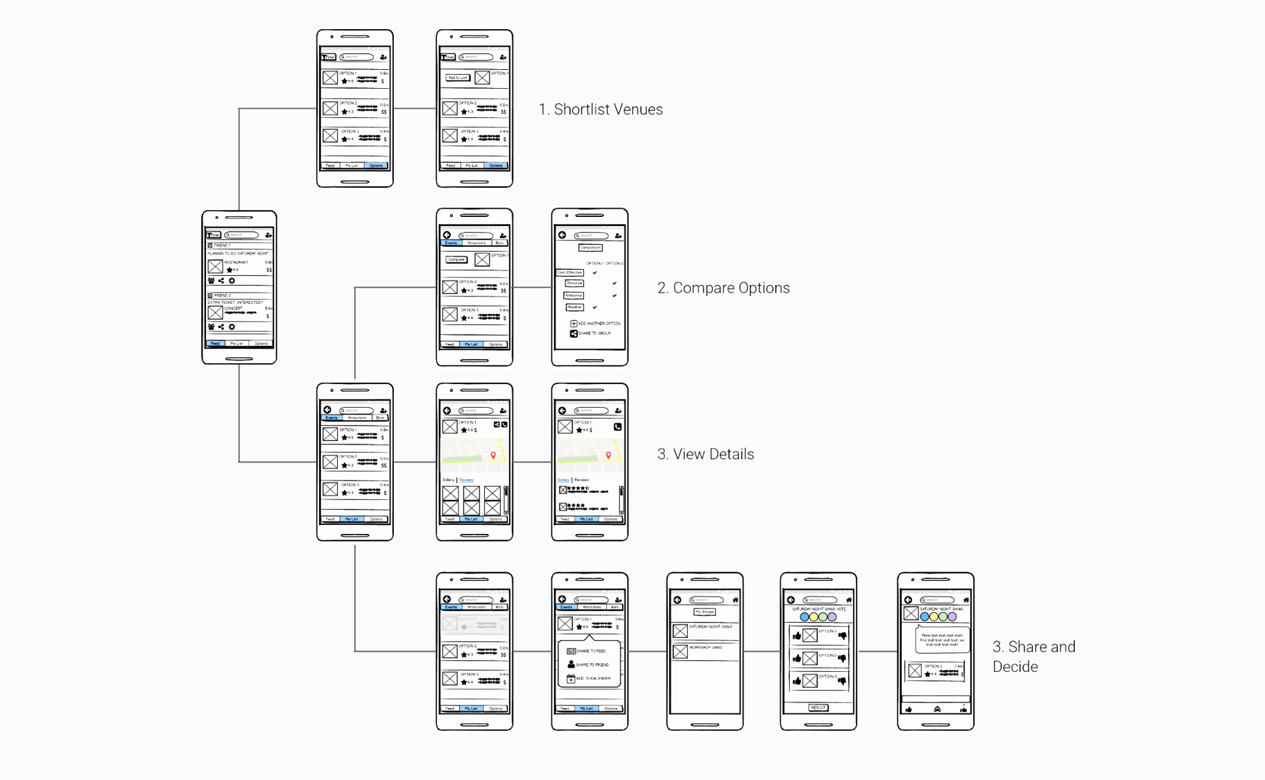
After the first evaluation, we decided to eliminate some features and focus more on the main feed page, the list page where all the user’s saved options go to, the options page which has suggested recommendations based on the filters the user has set and the group features where the user can plan for the outing with his/her group of friend who are interested in the plan. We designed wireframes which we could use to evaluate if a user could understand what all he/she could do with the app without any on-boarding. We also wanted to check what type of interactions would be more intuitive for a user since there is an extensive range of interactions possible with a touch-screen device. In addition to that, we also checked if the user interpreted the icons as what we intended them to be. The medium fidelity screens are presented below.

Usability Evaluation (Low-Fidelity Wireframes)

Although the medium fidelity prototype needs final changes and polish, it embodies the core structure of the application and depicts the purpose of the system. The infographic below highlights what the users can do with the application.
Recommendations for next iteration of prototype
The icons for “Groups” and for “Add me to Group” should be swapped
There should be tooltips that specify what each feature icon does
Long pressing and tapping the options is a more intuitive gesture to compare the them.
Details of distance/cost should be added to the comparison page instead of just tick marks
Just by swiping left the option should be added to list, swiping right should permanently delete it from suggestions
User should be able to tag friends to an event/place as a way of inviting them into the plan in case he/she does not want to share it to the feed where everyone can see it
User should have an option of rejecting a request without hurting the requester’s feeling
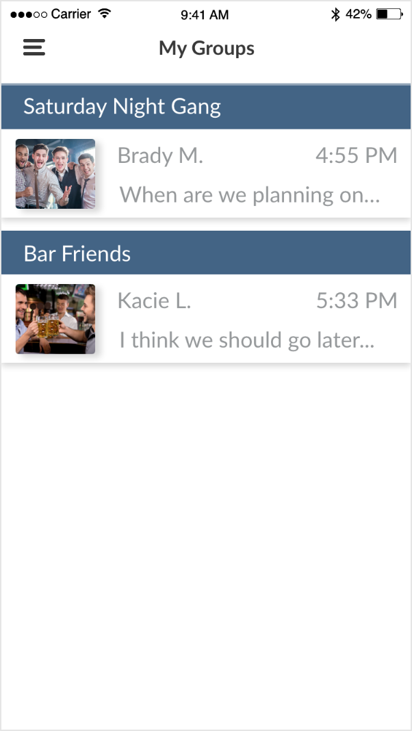
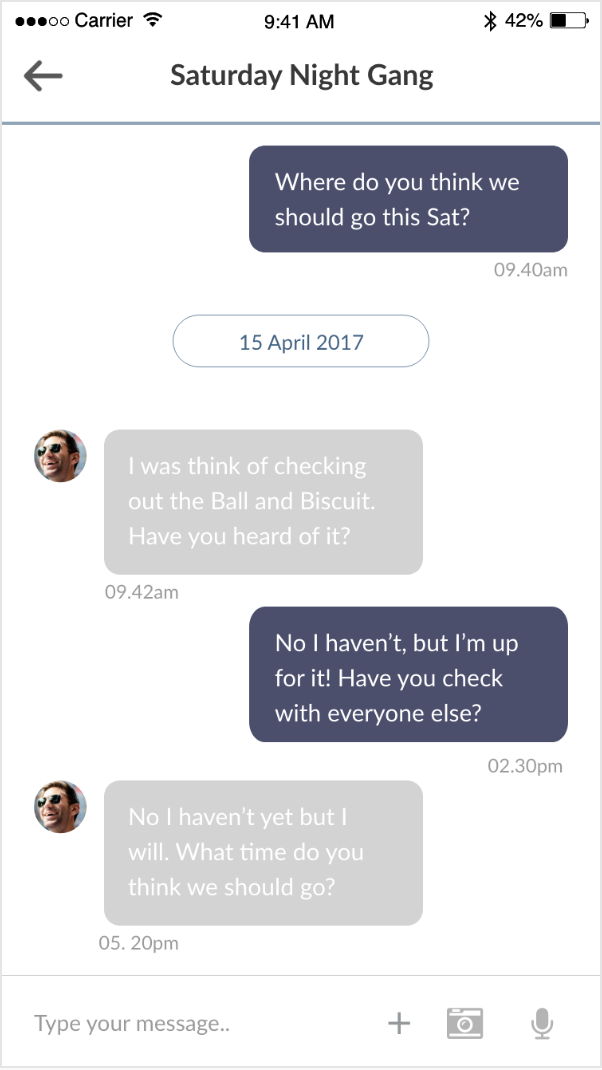
High-Fidelity Prototype
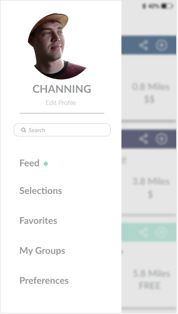
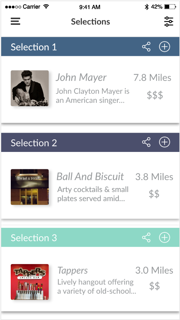
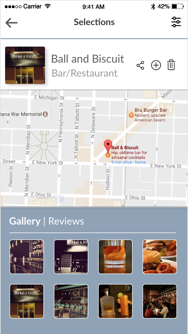
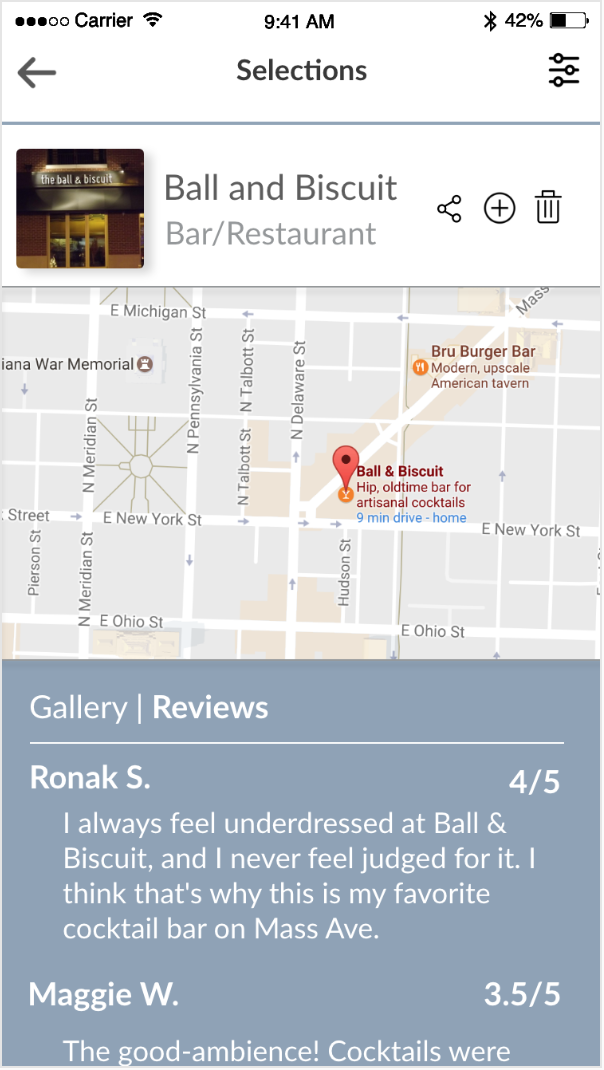
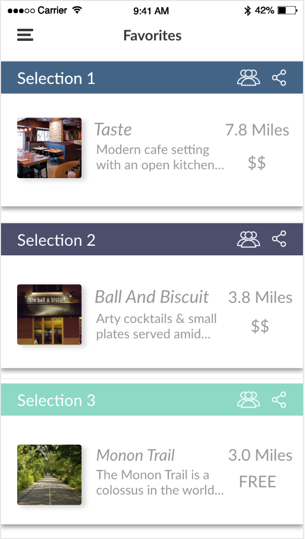
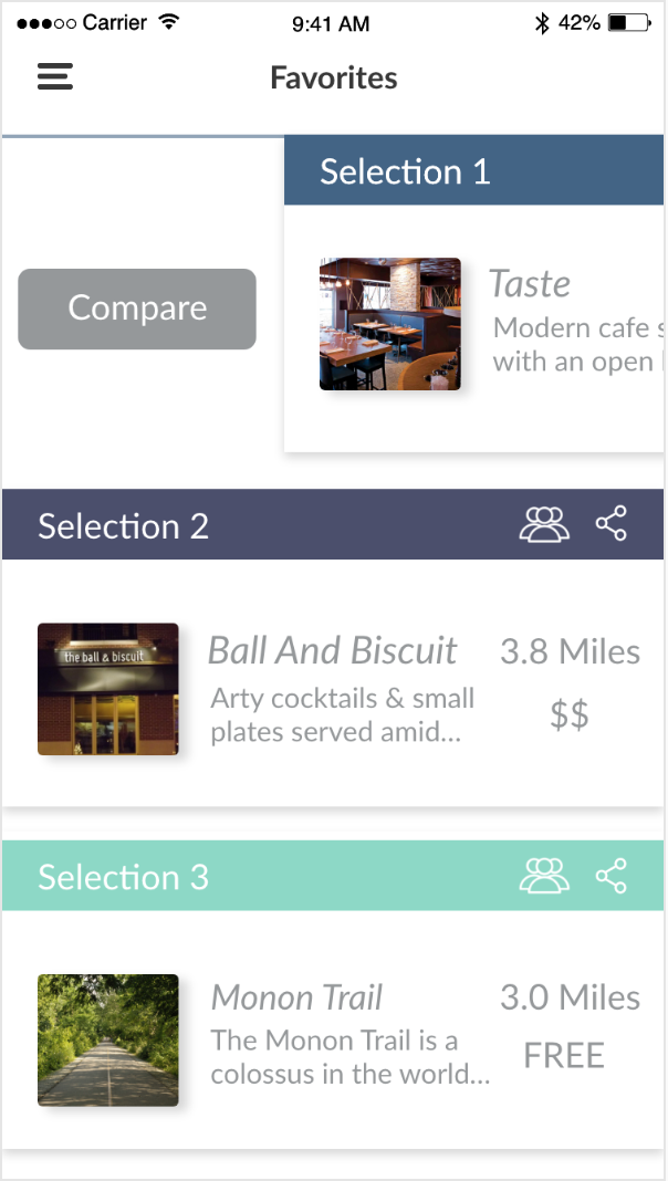
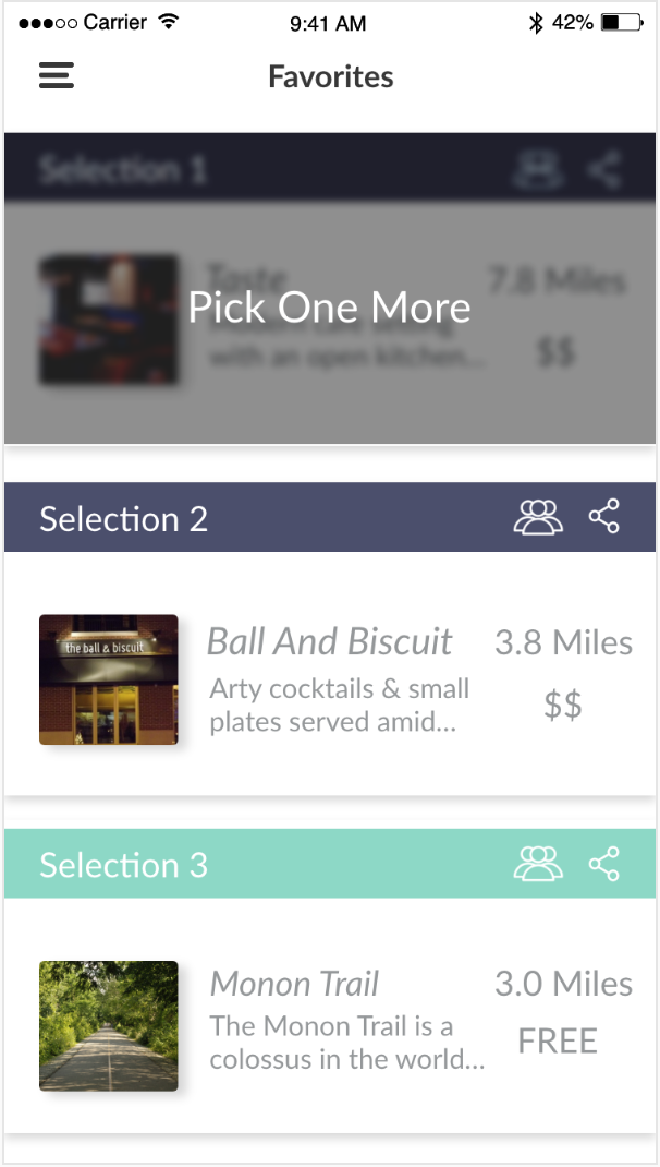
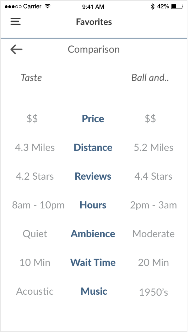
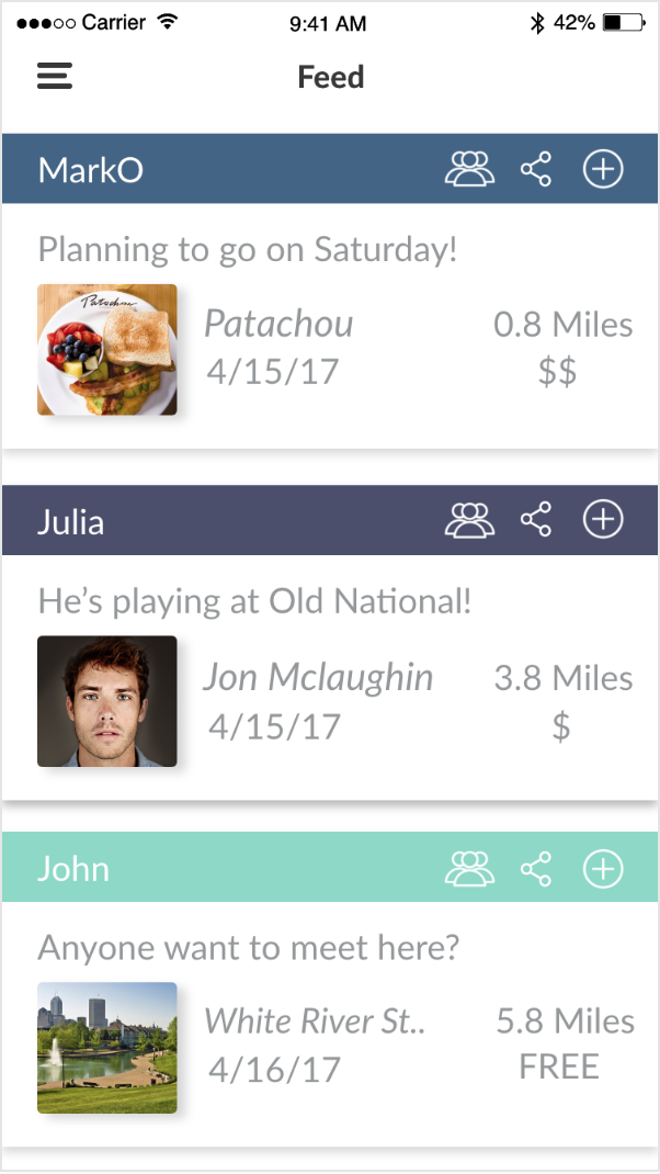
Usability Evaluation (High-Fidelity prototype)
All of the participants gave positive response to the functionalities of the application and said that they were fond of the concept behind it. Users sensed that it could have a real place in user’s lives by allowing them to keep track of their friend’s activities, and be a part of those activities when they chose to. In this way, they would be able to avoid having a feeling of being left out. They found the navigation to be intuitive and said that given the opportunity they would use the application in a real life scenario.
Final Application Overview


Learnings and Future Work
We received a plethora of feedback regarding the direction in which we could take the application. Although participants were universally satisfied with the concept and the functionalities of the application, some features were mentioned that upon proper implementation could improve the user experience of the application. They are as follows
Going forward we would like to be more considerate of the other stakeholders of the project – for instance the bar and restaurant owners and the event planners who would have liked to advertise their services due to lack of business or for expansion purposes.
There has also been mention of integrating applications that would supplement the functionalities of our product. So, the maps functionality could integrate with Google maps or Apple maps to make full use of their functionalities. Similarly, if transportation seems lacking, the product could integrate with applications like Uber or Lyft for increased convenience.
Ability to see events and selections from past.
Push information to calendar.
Ability to select the type of area that you want to be in (by water, downtown, in the suburbs).
We were unable to completely capitalize on the technical boundaries of the platform. Shortcut actions such as long press, double tap, swipe left or right, could have made interactions faster and simpler and are worth exploring depending on the relevance and context of use.
Being inclusive of such personalization and to be able to provide a system that does not push the cognitive load over the user’s comfortable capacity is an obstacle that needs to be overcome.